
We’ve discussed the best (or, what Lifetime has deemed to be the best, anyway); now let’s discuss the rest.
EMILY PAYNE
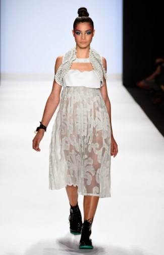
Photo: Blogging Project Runway
Like much of what Emily presented throughout the season, her decoy collection was kind of interesting, a bit sloppy, and very dated. Her biggest flaw from my perspective was that she considered herself to be an extremely innovative, alternative designer, but she doesn’t seem to have updated her aesthetic since the 90s. Twenty years ago, I’m sure her style would have been forward-thinking and fascinating, but now… not so much. This first look encapsulates that problem: it’s awkward, but more in a dated way than an alternative way. Still, at least it had a modicum of interest, which is more than I can say for Kini’s finale collection.

Photo: Blogging Project Runway
I think most outfits max out at two cut-outs. Add a third, and it just looks like the entire outfit is falling apart at the seams.
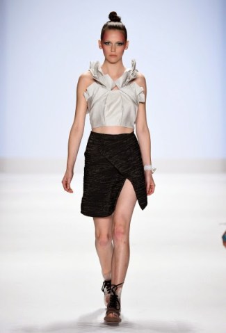
Photo: Blogging Project Runway
The top is pretty, but I’m not sure this skirt was the best thing to pair it with. Also, is she wearing clear Doc Martens? I don’t know if I can support that.
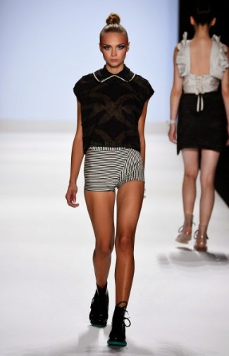
Photo: Blogging Project Runway
You can see the back of the previous look in the background, which makes me angry, because I liked that top until I saw it from this angle. It had more than enough going on in the front – it didn’t need to be a corset in the back as well. Anyway, this is one of the weaker looks of the collection. An ill-fitting collared tee and some shorts that are basically underwear? I’m underwhelmed.
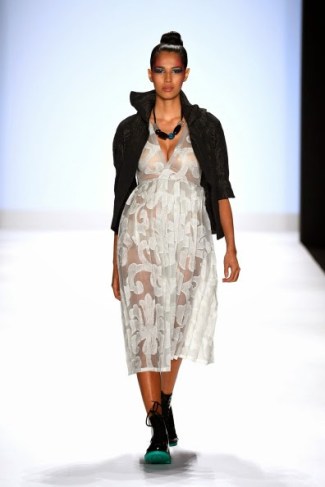
Photo: Blogging Project Runway
Yeah, she definitely didn’t need TWO babydoll dresses in this same fabric. And my breasts ache just looking at how smooshed the poor model’s bust is.
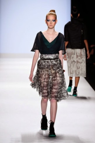
Photo: Blogging Project Runway
The skirt fabric is incredibly beautiful. Delicate, but with a touch of badassery. I wish the top were a bit more interesting, though.
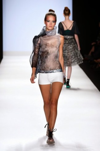
Photo: Blogging Project Runway
This blouse is the first piece of Emily’s collection that really, truly excites me. I think it’s fan-fucking-tastic, and displays all of Emily’s strengths as a designer. Sadly, she didn’t keep up this level of creativity and expert execution throughout the collection, but SHIT, do I love this top.
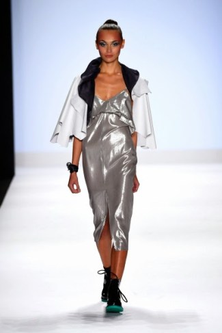
Photo: Blogging Project Runway
I don’t think I could hate this dress more if I tried. That is some sad, ill-fitting, tacky crap.

Photo: Blogging Project Runway
I loathe the elastic-looking waistband, held together with what appears to be a string. I know the sloppiness is intentional, but it’s not working for me at all.
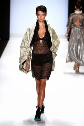
Photo: Blogging Project Runway
I don’t even know what I’m looking at. A shrug made out of a rug? Over a bathing suit cover-up? This was really not the best look to close out Emily’s collection.
KORINA EMMERICH
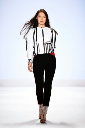
Photo: Blogging Project Runway
Say what you will about Korina’s atrocious personality, but her decoy collection was miles better than Kini and Char’s collections. Had she made it to the finale, I probably would have given her the win over Sean and Amanda, because she combined effortless cohesion with some really interesting, wearable, aesthetically-pleasing pieces. I don’t think either Sean or Amanda really managed all that. I’m not going to pretend this was the most original collection on earth – it’s got more than a touch of former PR contestant Mila’s 1960s mod aesthetic, and influences from lots of other designers – but I think it had a strong point of view. I’d wear this jacket in a heartbeat.
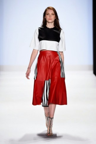
Photo: Blogging Project Runway
She made terrific use of leather and color in her collection. It kept each look connected to the one that came before it, without making me feel like I was watching ten of the same dress walk down the runway. And I think those clear booties with the black-and-white striped embellishments were strangely brilliant.
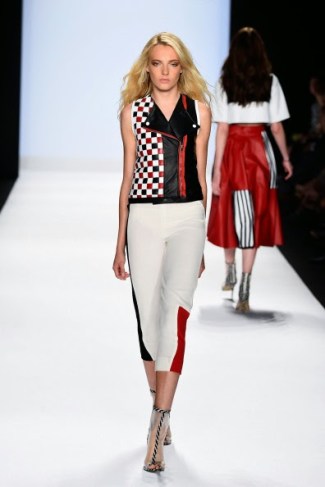
Photo: Blogging Project Runway
The vest is killer; the pants are adorable.
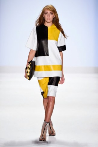
Photo: Blogging Project Runway
Ship this one off to Solange Knowles. She would work the SHIT out these oversized co-ords. It’s a refreshing, modern look.

Photo: Blogging Project Runway
I think I’d be thrilled to wear every single jacket in Korina’s entire collection.

Photo: Blogging Project Runway
I love the teal color, but I think this is one of Korina’s weaker looks. The top is a bit strange, proportionally-speaking, and the skirt is approaching Hefty-bag territory.
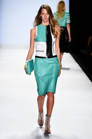
Photo: Blogging Project Runway
Love. Want this in my closet right fucking now.
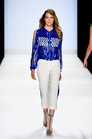
Photo: Blogging Project Runway
Not my favorite, but I like that she took a risk with those strips of fabric.
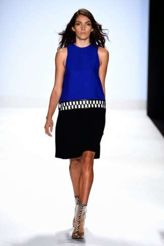
Photo: Blogging Project Runway
Not quite interesting enough, but very wearable and chic.
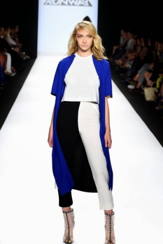
Photo: Blogging Project Runway
I don’t love this as a closing look, mostly because I can’t really see enough of any of the pieces. The two-tone pants disappear within the lining of the coat. I can’t really tell what that coat is – the color is certainly delightful, but I really needed to see more of it. And the crop top underneath just feels like an afterthought. Overall, though, this was a collection that far outshone its fellow decoys, and probably could have snagged the win for the entire season.
SANDHYA GARG

Photo: Blogging Project Runway
For a second, I thought the word on this dress was “FEELINGS,” which made me laugh for about ten minutes until I realized it actually says “FEARLESS.” I like the ombre effect, but if you’re going to put giant letters on your dress, I should probably be able to read them.
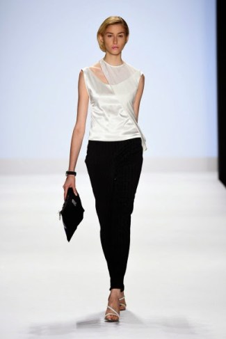
Photo: Blogging Project Runway
A borderline throwaway look. I don’t hate the top, but Sandhya is supposed to be a fuck-load more creative than this. I’d rather see a collection of over-designed, absolutely crazy looks than a bunch of boring monochromatic pieces, particularly from her.
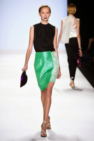
Photo: Blogging Project Runway
I don’t think the asymmetry alone is enough to make this skirt a success. The darker green fabric just looks puffy and uncomfortable, and I don’t like the way it looks on the model’s figure.
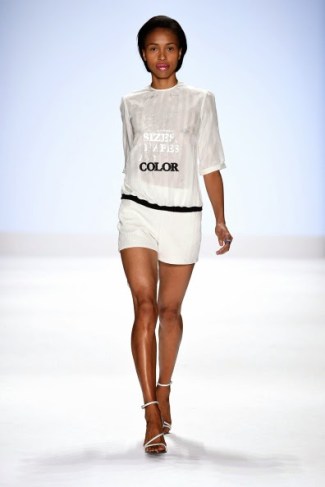
Photo: Blogging Project Runway
Congrats. You made a tee shirt and shorts. THIS IS NEW YORK FASHION WEEK. TRY HARDER. (Also, I reiterate my earlier complaint: don’t put words on shirts that I have to squint to read.)

Photo: Blogging Project Runway
I would have liked this a million times better if she had actually lined it instead of just throwing yellow panties on her model. That just seems lazy to me.
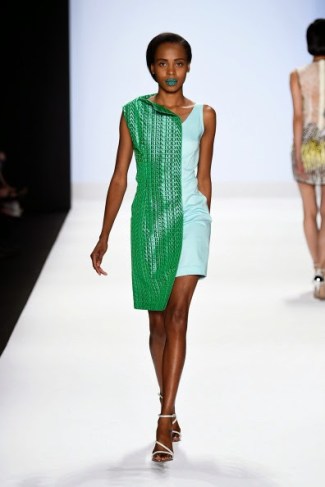
Photo: Blogging Project Runway
I’m sure she was going for interesting and intentionally askew, but it looks more awkward and accidental than anything else.
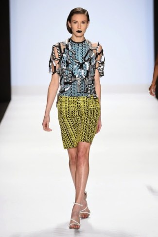
Photo: Blogging Project Runway
Pretty damn cool. Again, I can’t really tell if those letters are supposed to spell something, but I care less here than in the other looks, because this one is so much more interesting.
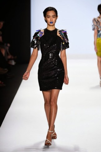
Photo: Blogging Project Runway
A basic LBD with dumbass shit on the shoulders.
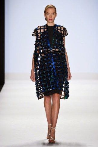
Photo: Blogging Project Runway
This is starting to feel more like the best of Sandhya’s admittedly weird aesthetic. The way she pulled the fabric closer together for the sleeves really speaks to me, for some reason. I just love that detailing on the shoulders.

Photo: Blogging Project Runway
Hate the white underlay; love everything else about this. I can’t say her collection really lived up to the level of creativity I know Sandhya is capable of, but it was interesting all the same.
ALEXANDER KNOX
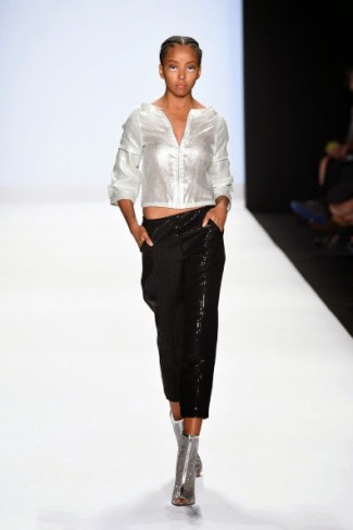
Photo: Blogging Project Runway
I’m not a fan of Alexander’s collection. Every outfit looked weirdly cheap, painfully derivative, or both. His fabric choices weren’t particularly interesting, and the only looks I liked were straight out of other, better designers’ collections.

Photo: Blogging Project Runway
A fantastic dress that he straight-up stole from about a billion other designers. Oh, and the hair and makeup are very clearly ripped off from some of McQueen’s recent runway shows.
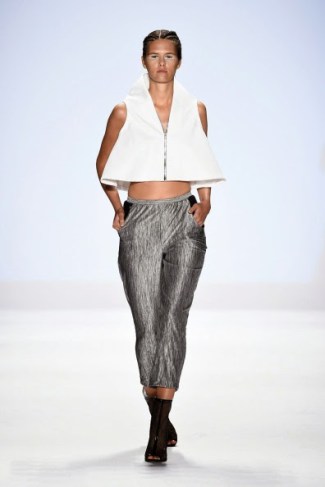
Photo: Blogging Project Runway
Taking regular clothes and chopping them into awkwardly short lengths does not make them interesting, Alexander.
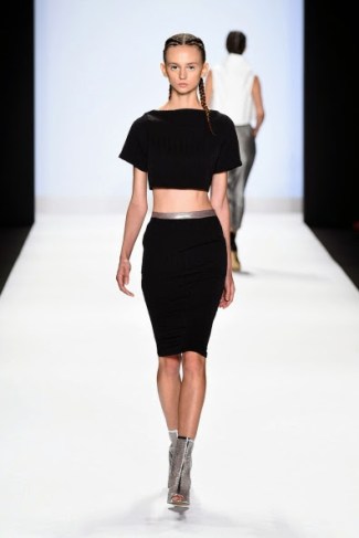
Photo: Blogging Project Runway
The sartorial equivalent of a basic bitch.
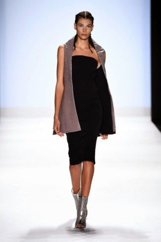
Photo: Blogging Project Runway
Snooze.
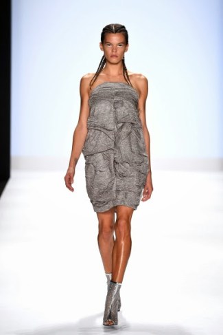
Photo: Blogging Project Runway
Hideously unflattering and ugly to boot.
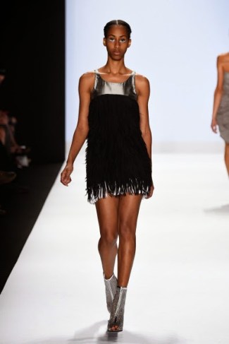
Photo: Blogging Project Runway
Unimaginative, and not particularly well-made.

Photo: Blogging Project Runway
It’s not Alexander’s fault that Sean has forever turned me off to fringe, but I cannot look at any more of this shit for a solid six months after this. I have officially overdosed on fringe.
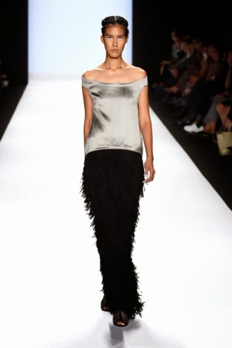
Photo: Blogging Project Runway
As far as I’m concerned, Alexander’s collection was one big “whatever.”
FÄDE ZU GRAU
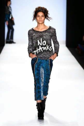
Photo: Blogging Project Runway
Fäde’s collection was probably the most hit-or-miss of the decoy collections. The writing on his outfits only sometimes work, as did his combination of textiles. This first outfit (like much of his work) looks more like really cool pajamas than really cool runway fashion, but at least his work is preventing me from falling asleep at my desk. I can’t say the same for Alexander’s collection, that’s for damn sure.

Photo: Blogging Project Runway
Killer jacket, but the pants look REALLY dated. Does anyone even cuff their jeans anymore, unless they’re really short like me and haven’t gotten them hemmed yet?
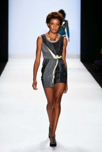
Photo: Blogging Project Runway
A cute dress, but it doesn’t pack nearly enough of a punch to be on a New York Fashion Week runway.

Photo: Blogging Project Runway
Nope. I absolutely refuse to support overalls. And again, the “SO?” thing doesn’t really work for me, mostly because the sizing and centering is off. But not “off” enough to make it seem intentionally askew.
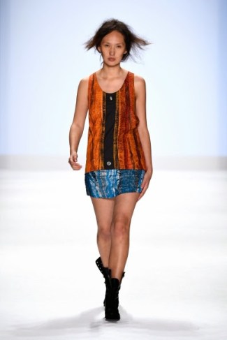
Photo: Blogging Project Runway
A waste of a look.
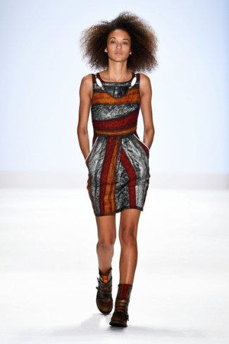
Photo: Blogging Project Runway
I want this dress in every color imaginable.
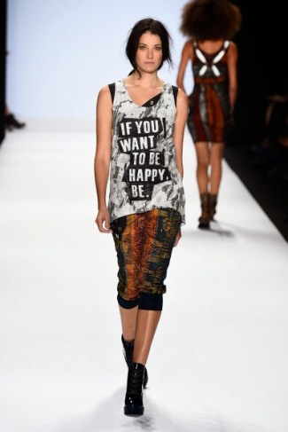
Photo: Blogging Project Runway
The only text-textile that worked for me. I like the printed pants too, but they might be too casual to be paired with an already casual top.
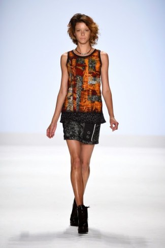
Photo: Blogging Project Runway
It’s a decent look, but I’m not sure it adds anything to the collection that wasn’t already there.
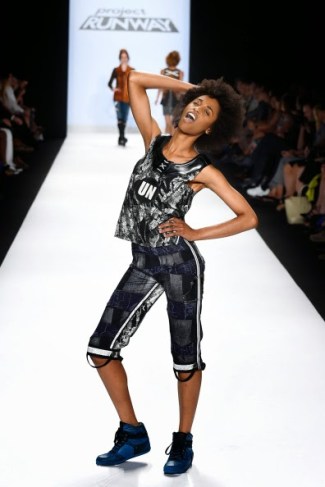
Photo: Blogging Project Runway
Extremely fabulous workout clothes.
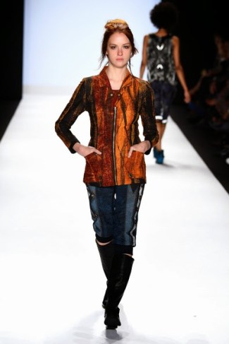
Photo: Blogging Project Runway
A strange pick for the final look. I like the jacket well enough, but the short pants with knee-high boots just seem completely nonsensical to me.
—
© Democracy Diva, 2014.
. facebook . twitter . pinterest .

Emily: I agree, kind of dated. I also want to add that the proportions for most of her designs are off and therefore terrible unflattering. I agree. the one blouse was the only piece in her collection I really, really liked.
Korina: I agree, that was a strong collection, but not a contender for the win for me, because it looked so heavy overall. I also wish that she had stayed away from the blue/white pattern, because that one catapulted her collection form “new take on the 1980s” straight to racing fashion. Her first piece was definitely her strongest, and I wish she had stayed in this slightly more toned down colour-blocking. In general, I liked her red pieces, was iffy about the yellow ones (not because of the colour, but because that was the point it looked “heavier”), really dislike the teal ones (despite loving teal), and wish they had improved the blue ones slightly. The one jacket looks like it was the first piece she did after her elimination.
Sandhya: Would have been a strong contender for the win if she had still be in the run. The second look doesn’t fit into her collection at all though. Unlike you I liked the effect on the writing, but I didn’t like the actual messages. Honestly, who wants to have “bomb” writing over her breast and “explosion” over her crouch? Or inviting messages on a dress which looks like it peels of the body easily? I also think that she repeated the some silhouette and the same décolleté way too often, which is the main reason I am gravitating more to Fäde’s collection.
Alexander: Sloppy made, monochromatic, very basic and no clear point of view. Easily the worst of the collections.
Fäde: I love Fäde’s first look. It has such a laid back feel to it, I love the pattern mixing, I like the message in this case, and while that is a bad indicator for fashion week, I would wear it in a hard-beat. It was a good statement piece for what will come. Like you I love, love, love the jacket in the second look, and unlike you, I don’t mind the pants at all. The use of lace in it (hard to see on the photos, sadly) is very interesting. The third one looks like the last minute look every designer had somewhere in their collection…four weeks is simply not enough time. The fourth look is the only true miss, because it looks too juvenile. Wouldn’t necessarily call the fifth a waste, because again, great pattern mixing, and I think there was some interest in the back. The dress is fantastic, as is the last jacket (and I normally don’t like orange,,,honestly, is that the colour of the season?). The pants…I want every single one of them. Did you notice that the pattern is different on each leg, but someone compliments each other so well that it doesn’t look asymmetric at all, even though it technically is? And the way he used buttons?
Ironically the one write on textile which worked for you is the one I don’t like at all. Too long and too preachy for my taste, and the pattern mixing is less interesting in this piece.
All in all Fäde had pants in more or less all possible length, shirts, dresses, jackets…it is very, very sellable, and has a very clear point of view. Which is basically: Woman want to feel comfortable in clothes. You can wear a bra under all those pieces. And did you notice that he had models which were not as much stick figures as usual, in all kind of skin and hair colours, with barely any makeup? It’s like he was trying to send a message, that every type of woman can wear his designs, and feeling good in them.
If those designers would have been in the finale, I would have rooted for Fäde, but would have been okay with a win for Sandhya.
I definitely understand your critique about Korina’s collection being too heavy. I didn’t mind that, but you’re right that it was a problem. Despite that flaw, though, I still think hers kept my interest at least as much as Amanda and Sean’s collections, if not more.
I definitely agree with you re: the amazing level of detailing and woman-friendly wearability of Fade’s collection. As you said, wearability isn’t always the best indicator of what makes a good NYFW collection, but I so appreciate something that reflects real women, just like you.
I agree, Korina’s collection was stronger than Sean’s (who lacks a clear point of view in my eyes) and Amanda’s (whose point of view is kind of boring).
Korina had the collection that appeals to me the most. That being said, I found all the vinyl-esque too much at a certain point, overall it just gives a heavy-handed feel to the whole collection…
Yup, there’s definitely a consensus among the commenters that her collection was too heavy, and I don’t disagree. But like you, I still thought it was the best of the decoys.
Have you decided you won’t be covering the All-stars Season then? I just left The States and am trying to find a live stream of it but alas no such luck.
Yes, no All-Stars for me! Partly because I have no time, and partly because I have no interest in pretending these contestants who I can barely remember are “All Stars.” But I’ll be back to recapping for the next regular season. I think the Lifetime website streams new episodes, but that might not be available overseas. I’ll let you know if I hear about any other streaming options!
Thanks appreciate it but after finding out that Snooki and J-Wow were guest judges I too have lost the will to watch. ..Oh how far PR has fallen.