Ughhhhhhhh.
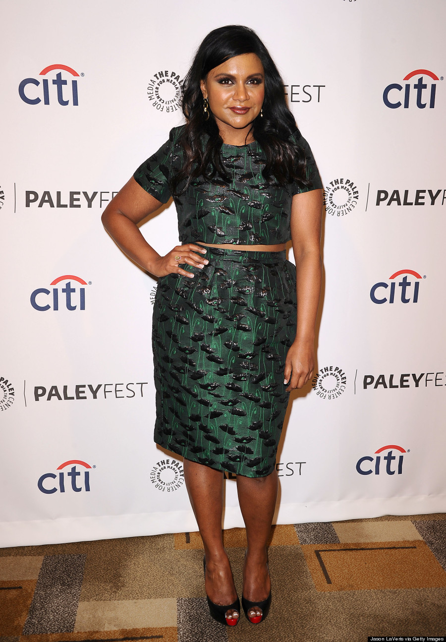
CANDICE CUOCO
Fourth Place

Photo: Lifetime
There’s an inherent problem with the structure of Part 1 of the finale episodes: it gives the judges the chance to critique everything they hate about the collection, but it doesn’t give the designers enough time to actually do anything about those critiques. So when Candice heard that her collection was overblown and derivative, there wasn’t much she could do except water it down, which didn’t actually make things any better. Telling Candice that her looks were blatant McQueen knock-offs wasn’t bad advice, but expecting her to be able to turn a copycat collection made for drag queens into an original one made for women in 48 hours was not even slightly reasonable. Wouldn’t it be better if the judges never saw a glimpse of the collections until the final runway show? At the very least, it would spare us the torture of having to watch the designers rush to fix problems that simply are not solvable in two days’ time.
This first dress is lovely, though as Candice herself noted, it has basically nothing to do with the rest of her collection. If you consider this dress in a vacuum, it’s a good one to start off the collection – it’s got a dark romance to it, and it fits better than just about every other garment Candice showed – but its lack of cohesion with the rest of the collection makes it a TERRIBLE choice for an opening look. The opening look is the fashion equivalent of a thesis statement, and this thesis statement appears to be about an entirely different topic than the rest of her paper.

Photo: Lifetime
I don’t really understand what makes Candice think she’s such a badass. A leather bustier does not a rocker chick make, at least not in 2015. And those slightly-cropped pants combined with the thick ankle-strap shoes were a truly awful idea.

Photo: Lifetime
Once upon a time, eons ago, you could count on these runway shows to have very few fit and construction flaws, and you could actually judge the collections based on aesthetics and vision and creativity and all that. These days, the designers are fixing so much of their collections in the hours before the runway show that the fits end up looking disastrous. This was a serious problem in Candice’s collection, whose leather pieces looked utterly depressing as they wrinkled their way down the runway.

Photo: Lifetime
Those blacks don’t even match each other. That is a rookie mistake, my friends.

Photo: Lifetime
This coat is still the only thing I really like about Candice’s collection, and I still find the garments underneath to be absolute wastes of space. For the love of all that is fashionable, just create an actual pair of pants that someone would actually want to wear to a place that isn’t a gym.

Photo: Lifetime
I don’t hate the skirt… mostly. I’m sorry, that’s about as much enthusiasm as I can exude over this collection.

Photo: Lifetime
This fits so terribly, I’m shocked it actually made it to the final runway. This is borderline offensive.

Photo: Lifetime
I don’t hate it, but I can’t pretend it’s original, either.

Photo: Lifetime
Things I hate: the fit of the bustline; the fit of the hips; the way the black leather seems into the red fabric like a claw from an arcade game; THE FUCKING EXPOSED ZIPPER, MY GOD, WHY WON’T THIS SHOW LET IT DIE ALREADY.

Photo: Lifetime
This originally had a giant hoop skirt beneath it, making it an over-the-top show-stopper of a piece. (Not an original one, or anything, but at least it brought the drama.) The watered-down version is more wearable, sure, but I also don’t understand what’s happening with the construction, particularly in the back. It looks like there’s some skin showing, and maybe like this skirt was tied together with black ribbons? That doesn’t make a great deal of sense to me, though I’ll admit I could see this dress on the red carpet. Mostly because, you know, people have already worn it.

Photo: Lifetime
When you see all the looks together, two things become even more apparent: 1) that opening look sticks out like a sore thumb, and 2) this collection mostly resembles what a cartoon fashion designer’s idea of grown-up, cool-girl fashion is, instead of the real thing.
EDMOND NEWTON
Third Place

Photo: Lifetime
I had to laugh when the judges told Edmond that his simplest garments were his strongest. I mean, they’re not wrong – his attempts at drama and fantasy are damn near atrocious – but his simple garments are as dull as the day is long. Do you know why Heidi and other women would want to wear Edmond’s clothes? BECAUSE THEY ALREADY OWN THOSE CLOTHES. I have never seen him make a decent dress that hasn’t already been sold at every department store in the universe.

Photo: Lifetime
All wrong. This is not how you experiment with volume. This looks like one huge, nightmarish, extremely shiny accident. And it doesn’t even come close to fitting in with the rest of the collection.

Photo: Lifetime
Didn’t Duncan get eliminated for this exact draping style in the season premiere?

Photo: Lifetime
Yeah, sure, let’s pretend this is high fashion, runway-ready, or in any way worthy of being shown at New York Fashion Week. Project Department Store? A surefire winner. Project Runway? Abso-fucking-lutely not.

Photo: Lifetime
I will not even dignify this with a response.

Photo: Lifetime
My fiancé pointed out, quite wisely, that he could see Kerry Washington wearing a lot of these pieces. And that that wasn’t a compliment, since when she fails on the red carpet, she fails spectacularly. (Kerry tends to have very high highs and even lower lows when it comes to her fashion choices.) I think this dress best reflects his point – I could see it on a red carpet, but definitely not on a best dressed list.

Photo: Lifetime
I wish I could bring myself to care about dresses like this, but I simply cannot.

Photo: Lifetime
This looks pretty bad in pictures, but I assure you, it looked infinitely worse on television. This was one of the least-flattering garments to ever appear in a finale episode of Project Runway. If Edmond can’t look at this and see the myriad of things that are wrong with it, then he’s got no business showing at Fashion Week.

Photo: Lifetime
Yeah, let’s all just pretend that this doesn’t look like a cat got into a roll of toilet paper.

Photo: Lifetime
At least it’s pretty, well-made, and slightly dramatic. It’s still not winning any awards from me, but it’s the only piece in the collection I am not diametrically opposed to seeing on a runway. (Again, probably because I’ve seen it on the runway before.)

Photo: Lifetime
You’d think only using three colors would make it easy to make a collection cohesive, but, apparently not. Anything that’s even slightly more than the most basic LBD doesn’t even look like it goes with this collection.
KELLY DEMPSEY
Runner-Up

Photo: Lifetime
My girl. My beloved Kelly from the Deli. She’s not perfect, not by a long shot, but she was by far the best of the pack this season, and it actually broke my heart a little bit, the look on her face when they announced Ashley was the winner. It looked like, for the first time in Kelly’s life, she really thought she had won, and I think we’ve all had that moment where we were FINALLY sure of success, and then the rug was pulled out from under us. After the judges named Ashley the winner, I gave one extremely frustrated, “Really?” and then just quietly stared at my television for a few minutes. I couldn’t even work up my usual anger or sadness, because I’m not really surprised the judges refused to award the win to the clear winner (yet again). More than anything, the decision just made me tired.
Anyway, the clothes: these pants are too sheer, but this silhouette is extremely interesting. More weird than wearable, but I’ll take a modicum of originality over Edmond’s sea of basic dresses any day of the week.

Photo: Lifetime
This is a damn fun dress. Tim said it best when he mentioned that what makes Kelly great is that her clothes make you smile. They have a youthful exuberance that I’m drawn to. They’re not the most expensive-looking or the most elegant garments, but they have a spark of badassery and a metric shit-ton of attitude.

Photo: Lifetime
I think she should have maybe done some kind of piping around the cut-out in the back – as is, it seems like a big droopy hole (which is also the name of my feminist punk bank). But I love the sporty-chicness of the front, and the textures Kelly created with her fabrics.

Photo: Lifetime
The glittery accessories mostly served to amp up the volume of Kelly’s looks, but here, they just look like Barbie rejects. They bring the clothes to a cheaper, tweenage level. A shame, because that bra could be something interesting if it were styled correctly. But that skirt, even with the Kelly-made textile, doesn’t really do much for me.

Photo: Lifetime
I’ll admit, I like this outfit much better than I did last week. The fit and proportion are vastly different – see what a world of difference the fit makes? – and now that I can see what Kelly was aiming for with these pieces, I get it. It works.

Photo: Lifetime
Meanwhile, these pants have really not grown on me. Is it me, or do they make the model look like she has a teeny tiny penis? Don’t get me wrong – I’m absolutely fine with the model having a teeny tiny penis. I’m just also fairly certain that wasn’t Kelly’s intention.

Photo: Lifetime
Utterly, impossibly cool. Kelly should have won solely for her ability to make a fannypack look chic.

Photo: Lifetime
I agree with Nina that this was a tad too ice-dancer-y to really feel high fashion, but I still give Kelly snaps for the work she did with these textiles. Just think about how much thought and detail had to go into every single piece in order to accomplish those patterns, and then compare that in your brain to what Edmond or Ashley did.

Photo: Lifetime
I’m not a fan of this white stretch fabric in general – it’s cheap-looking in photos, and you can see the seams right through it – but I love the collar and the waistband.

Photo: Lifetime
I’m still split on whether or not I hate Kelly’s final look. I have a knee-jerk negative reaction to those zip-up thighs, but there’s something downright ballsy about the disco-centric craziness that is this jumpsuit. Even if I’m unlikely to wear almost anything Kelly showed, I still think she was the clear winner of this season (which isn’t saying much, but, what can you do).

Photo: Lifetime
Together, Kelly’s models look almost shockingly cohesive and cool. A collection should be more than just the sum of its parts, and I think only Kelly managed to achieve that lofty goal. Though I’ll never be able to support that white stretch polyester-looking fabric. I’ve heard this collection looked AMAZING in person, so I’ll blame my hatred of that fabric on a trick of the light, because OOF, y’all.
ASHLEY NELL TIPTON
Winner

Photo: Lifetime
I have just a few hundred thousand problems with this collection. Let’s begin with the color palette, which is more appropriate for the Easter Egg Roll than it is for a fashion show. I think you have to be in kindergarten or on LSD to want to wear most of these colors together.

Photo: Lifetime
This isn’t so bad, but it appears to be a piece from an entirely different collection.

Photo: Lifetime
Let’s move onto the biggest crime of this collection: the fit. Oh, my dear LORD, the fit. For a collection that was supposed to be all about empowering curvier ladies, Ashley did them no favors at all. The judges heaped tons of praise on Ashley, for being so BOLD as to put a woman with curves in a crop top, as if she invented the concept. Spoiler alert: she didn’t. Don’t get me wrong – we should absolutely be encouraging women to love their bodies and show off as much or as little as they feel comfortable showing. But awarding Ashley the win because she made extremely unflattering, terribly-fit crop tops is just complete and utter bullshit. The producers made it so that Ashley was the only designer who used “plus-size” (I hate that phrase, but I’ll save that rant for another day) models, and then talked about how brilliant she was for being the only designer to use said models. What a bag of condescending bullshit that is. Project Runway wants to have it both ways – getting credit for doing something great for women’s body image, when they’re actually saying, “oh my god, it’s so hideously impossible to put clothes on a larger woman that we should give Ashley the win just for trying, even though virtually all of her garments look like shit!”

Photo: Lifetime
I kind of dig the texture, but loathe the silhouette.

Photo: Lifetime
This, from a woman who considers herself the best “plus-size” designer in the country, and whose belief in such was just reinforced by the show. Women of all shapes and sizes deserve SO MUCH BETTER than poorly-proportioned rompers.

Photo: Lifetime
I actually don’t hate this, because it’s the first garment I’ve seen that actually looks a little bit fashionable and/or original. It’s utterly nonsensical – the top looks like swimwear – and it certainly doesn’t come close to fitting in with the rest of her collection, but it’s not the most basic thing I’ve ever seen in my life. So I guess that’s an achievement.

Photo: Lifetime
Curvy women need real clothes that they can feel confident in. Not kangaroo pouches.

Photo: Lifetime
I don’t even know what I’m looking at. Seriously, someone please tell me what in the fuck this thing is. Is this model supposed to be from a modern-day retelling of Grey Gardens?

Photo: Lifetime
It’s fine. It’s a knock-off, but it’s not nearly as poorly made as some of Ashley’s previous entries.

Photo: Lifetime
I was furious to hear that Ashley glued those flowers onto her garment. It’s one thing to resort to the glue gun when you’ve got twelve hours to put a dress together. But for your FINALE COLLECTION? You had weeks to work on this thing, in the privacy and comfort of your own home, and you couldn’t be bothered to sew the fucking flowers on? To me, that is inexcusable, and completely encapsulates Ashley’s faults as a designer. Her attention to detail is almost nonexistent, and it’s why I had such a problem with almost every aspect of her collection.

Photo: Lifetime
These poor women. Project Runway is holding this image up as the peak of body-positivism, even though these women all look like they’re crying out for a real makeover. One that pays attention to fit and form and silhouette, and truly celebrates their bodies, instead of just giving lip service to them for the ratings.
Thank you all for helping me survive another disappointing season of Project Runway! I will NOT be recapping Project Runway Junior – the only thing I hate more than Project Runway is children on reality television – but check the blog again next week for my recap of the Season 14 decoy collections.

I have an idea. Let’s go back and declare “no contest” and suspend the prize. I don’t think any of the four had a collection deserving a win. As a plus-sized woman, I cringe at Ashley’s idea of fashion to celebrate the full-figured body of women.
Maybe the prize can be split amongst those brave few of us still watching the show. I think we’ve earned it!
I love Kelly’s final look.
Otherwise I am shocked. I am all for designing for plus seized woman but then DESIGN FOR PLUS SEIZED WOMAN!!!! Nothing makes a woman look even more fat than piling a bunch a fabric on her! The right way to deal with this are clothes which emphasis the curves on the right places, but add as few as possible. Also, there are a number of tricks to make them look smaller. Like using dark colours on the sides to set up lighter colours in the middle. Oh, and nothing makes a butt look fatter than a giant zipper to emphasise the position of the crack.
I could have dressed every single of those models in a way that it wouldn’t even have occurred to anyone that they are “plus-seized” instead of just “curvy”.
Amen!
I take issue with the assumption that the point of designing for fat women is to make them look smaller or to make their butts look less fat. This comment is everything that is wrong with the way fashion treats the fat body.
I don’t think the point is to make them look smaller – I think the point is to make them look fashionable, and Ashley didn’t do that. I agree with what you’re saying about how badly fashion treats bigger women – as if women should have something to hide, or as if we should feel as if we don’t deserve great fashion because we’re not models – but I don’t think that’s what Swanpride was trying to say. I didn’t hate Ashley’s collection because it made her models look fat – I hated it because it pretended to be revolutionary for women with curves, but didn’t do anything for them or anyone else.
If it makes you feel better, I would say the same if it were a normal sized models. My main issue with the exposed zipper on skirts has always been that it paints a crack on the models butt and makes it looking bigger than it usual is, and the biggest sin a designer can do in my book is making a superthin model look plus-sized. To me fashion should be about showing off female curves. The midrift free dress which is linked in this article does this perfectly. This so called fashion makes those poor models look like giant baby dolls. And sorry, being plus seized myself, I think THIS is offensive. In a way it is offensive that some of those models are even called plus seized, because a few of them simply have a normal female body.
I read this blog faithfully. I understand that everyone is entitled to an opinion based on personal taste, but I don’t appreciate inconsistencies. This whole season, looks that appeared to be from American apparel were bashed (Ashley’s just fab look and her red carpet dress) and yet now Kelly’s collection is being praised even though it is completely American apparel with a dash of thrift store? That’s not right and contradictory.
I don’t think Kelly’s was that American Apparel – except for that white strech fabric, which I hated. I think it goes without saying that Kelly’s collection was far from perfect – and not even any good at all if you compare it to the show’s best seasons – but I think it displayed more creativity than any of the others that we saw this week. I don’t consider it high fashion, but I do consider it the best of the sad little bunch. To me, if any of these collections resembled American Apparel, it was some of Edmond’s little black dresses. But thank you for being a loyal reader! Here’s hoping the show gives us a collection more worthy of the good old days of Project Runway.
It’s depressing that Ashley’s bland eggplant lace and crop tops are given the win on a show that touts itself as a DESIGN-based competition, meant to award the most innovative, fashion-forward, and exciting designers America has to offer (Just try and look at Jay McCarroll’s collection next to it). Kelly’s, while definitely not perfect, was an absolute unique vision. I sincerely hope she can find someone to back her designs – I don’t want her to have to go back to the deli.
Yes. This is exactly how I feel about Kelly. Not perfect, but absolutely the most innovative of the group.
What made me particularly sad about Kelly not winning the competition is that she really needs the money to go forward. I would think that if you’re going to do something “politically correct” that you would give money to someone who is both talented and desperately needs it to continue. Kelly’s personality and zest for life is absolutely contagious. Ashley is already set up in a business of her own and could have easily used her time on project runway to increase her business – as Swapneil has already done. One interview I read said his business quadrupled as a result of being on the show. I hope that Kelly finds the investors that she needs – or is hired by fashion house. While her style is something I would never wear, there are lots of girls and young women who would.
I have the same hope for Kelly.
Love the band name!! I want to join 🙂 And agree with you on all points. Thanks for blogging this mostly craptastic season, Democracy Diva!
Some years back, there was a casual game called Jojo’s Fashion show. Most of Candice’s collection was literally taken directly from the cartoon fashion in that game. That, I find scary.
Forgot to ask – do you think you’ll be keeping up with Project Runway Junior?
Nope! But I’ll be back for the next regular season.
So many feels, many of which you perfectly encapsulated in your comments. Ashley’s “collection” is ATROCIOUS! What an awful color palette, the clothes flat-out don’t fit, and a f@#$ing GLUE GUN at New York Fashion Week? Not only did she admit that, but then.. she won. I am gutted. The integrity of this show is just completely kaputt! shamenun.com.
lolforever @ shamenun.com. You know that’s my favorite website.
Also, I just discovered Edmond was on this ridiculous show called Fashion Star on NBC. His looks were so, so basic and sadly, the sense of style barely evolved at all since he got to PR. I think he’s talented at construction and being put up to the design challenges of PR. But when it comes to his own design aesthetic… womp, womp. Mall budget-store worthy.
Oh, god, I remember that show. I never watched it because I was not about to pretend that Jessica Simpson had the talent to mentor anyone about fashion, but I remember it existing. I think one dubious fashion talent show on TV is more than enough!
As a curvy woman, I am offended that Ashley won.
It’s been a while since the season ended, but if you haven’t already, I would absolutely recommend watching Junior. It’s incredible. The kids imo are better designers than most of the so-called “adults” on the show. ANY of the Junior finalists’ collections would win at this finale and many finales before it.
Also, spoiler: THERE’S NO DRAMA. Like, at all. These kids do not fight whatsoever. It’s beautiful.
I’ve only just recently discovered your blog. I have just worked through all of your viewable recaps for past seasons. Love them. I’m still sticking with the current season (just!), and would love to read your comments. Have you decided to quit PR?