Project Runway Recap: S8 E6

This week’s episode of Project Runway was about as awful as last week’s was wonderful. A snoozefest of a challenge – reappropriating ugly-ass bridesmaids gowns for normal women. It led to the predictable drama of contestants being dumbfounded at the sight of a woman over 115 pounds and everyone cringing over the tacky-ass fabrics they had to use. Snore. And once again, the judges managed to piss off the entire blogosphere by giving another undeserving win. Let’s start the show.

ANDY

Design: I’m not saying it’s ugly or poorly made, because it’s not. But honestly, who besides a sex worker would actually wear this? I think the straps are gorgeous and the whole look is flashy and fierce, but there’s something so streetwalker about those chains and the skintight black seemingly-leather shorts. Also, really? ANOTHER butt zipper?

Execution: Pretty great, particularly on the top.

Styling: If Andy can tone down his stripper-chic style into something a little bit more accessible, he’ll really have something. Until then, I still like his new mohawk.

APRIL

Design: Another funky and youthful design that has April’s name written all over it. I’m a little bit concerned about how she really only designs things that she’d wear, but girl knows how to rock some blouse embellishments, and I like that. On TV, all the intricacies of the blouse really pop, and from the front, the dress is rouched nicely and fits her well. Loving the sleeve length, too.

Execution: From the back, this is clearly a bit too short, and the zipper points like a crooked arrow to her no-no zone. It looks much rougher in general from the back than from the front, which is problematic. But it’s a fine job overall.

Styling: LOVING the dramatic high pony and classic heels. They really make this girl look like a model.

CASANOVA

Design: I feel like socialites must have worn this to St. Tropez in 1984, and I don’t mean that as a compliment. The top is nice enough from the front, but the back just looks like a mistake. And blue satin skintight pedal-pushers? Are we serious?

Execution: Satin is an unforgiving fabric that shows every pucker and every mistake. Lucky Casanova got a “real girl” who looks like a model, or the judges might have noticed.

Styling: The hair looks stupid from the front, and those shoes should be a criminally punishable offense.

CHRISTOPHER

Design: This my choice for runner-up, as it’s one of the only garments on the runway that’s actually wearable. I mean, it doesn’t hurt for your “real woman” to drop out and Lifetime magically pulls out this glamazon for you to use, but Christopher did a hell of a job. I’d wear this dress tomorrow.

Execution: From the back, it looks shorter on one side than the other, or perhaps the hem isn’t straight, but it’s a minor offense. Very skilled handiwork overall.

Styling: Less is more. Simple shoes, a funky bracelet, and sex hair is all you need.

GRETCHEN

Design: I think the top and bottom are both great garments, but you’d have to be nuts to wear them together. The hand-painted shirt is exquisite; if it were a little longer in the front, I think any woman could rock that with a pair of skinny jeans. And the skirt is a dream. But it was a mistake to pair them with each other.

Execution: Everything looks just slightly unfinished – not sure if that’s intentional or not.

Styling: Gretchen needs to tear herself away from those tacky boots – she’s used them before, and they only make things uglier.

IVY

Design: Sorry, I just fell asleep looking at this picture. This is just so blah. Very housewife/country club. But shiny.

Execution: The top looks nice, but it’s all draping and no sewing. And once again, Ivy has proven that she can make a really ugly pair of pants.

Styling: The hair is Hillary Clinton meets Nancy Pelosi. Would you want to see that on a runway?

MICHAEL C

Design: Where do I begin? The length and cut of the sleeve is ugly. The pieces on the skirt look like they were added at the last minute and make the whole dress look sloppy. And I think it looks like a morbid 80s prom dress. AND THERE’S ANOTHER BUTT ZIPPER.

Execution: It’s about a mile too short, and nothing about this looks well-made.

Styling: That hair and makeup belongs in a burlesque show in rural Alabama.

MICHAEL D

Design: One day, there will be a designer on this show who can look at a larger woman and craft something beautiful instead of something insane. I’m holding out hope. I can’t say it any better than Michael did: She went from bridesmaid to bat mitzvah.

Execution: Where the lace meets the pink in the back of the dress – it’s a disaster area. And that black netting looks about as cheap as can be.

Styling: What the FUCK is that hair? (Cute shoes, though.)

MONDO

Design: An absolute winner in my heart, Mondo took a tacky disaster and turned it into this mod wonder. I would live in this dress. Unbelievably cute, great use of color-blocking, and totally body-conscious and flattering.

Execution: Nearly flawless.

Styling: I know everyone hated this Jersey Shore styling, but I stand by Mondo’s decision. I think that weird little man was inspired by this girl’s Jersey City roots (and her orange fake tan) and decided to run with it, Snookie-style. I love that she looks like she’s straight off the Seaside boardwalk.

PEACH

Design: Every mistake you can make was made here. The top is a disaster, and the green ruffles are absurd.

Execution: Everything looks homesewn.

Styling: Combat boots and stick-straight hair? I love the 90s just as much as the next girl, but come on.

VALERIE

Design: I love Valerie, but I judge her for not knowing how to design for a normal-sized woman. Because on a 5’10” size zero, this dress would have looked fucking awesome. But all the color-blocking just serves to point to different body parts in the least flattering of ways. And the back is flat-out tacky.

Execution: It’s just too tight, especially the straps in the back which look like they’re straining to rein her in. This woman should sue for defamation – her body is way better than this dress makes it seem.

Styling: The hair looks like a cheap wig, the purse doesn’t match, and black shoes would have been better.

Judge’s Top: Christopher, Mondo, Michael C (winner)
Diva’s Top: April, Christopher, Mondo (winner of my heart)

Judge’s Bottom: Valerie, Michael D, Peach (out)
Diva’s Bottom: Casanova, Michael D, Peach


Check back for more fashion and fabulous later this week! And don’t forget to follow your favorite diva on twitter @democracydiva!

Project Runway Recap: S8 E5

Drama, drama, drama! This week’s episode of Project Runway had more yelling, more tears, more bullshit, and more bitchery than ever before! I usually have no patience for such things, but instead of one stupid soundbite after another, people seemed to be genuinely going apeshit. So I loved every minute of it. But, unlike some bloggers, I’m not here to rant about how Gretchen’s a two-faced megalomaniac and her entire team was comprised of spineless jellyfish who gave up all their creativity and individuality to obey her every demand. I mean, it’s entirely true, but I don’t care. I’m here to talk about the clothes. So let’s start the show.

Keep in mind that Team Luxe (AJ, Andy, Christopher, Gretchen, Ivy, Michael C.) had multiple people working on the same look, so while everyone created something, no one except Ivy created every piece for any one look. Team Military & Lace (April, Casanova, Michael D., Mondo, Peach, Valerie) had each team member design their own individual look.

Team Luxe, Look 1 (AJ)

Design: A shiny shirtdress is rarely, if ever, a good idea. Didn’t someone already make a shiny shirtdress this season and get ripped for it? And didn’t someone make those horrible two-tone leggings last week and somehow get away with it? I just can’t support any of this. It’s just ugg.

Execution: AJ, whose design aesthetic is Heatherette meets Betsey Johnson (think cute cocktail dresses that are deconstructed and punk-ified), claimed that he was trying to prove to the judges that he could be tailored. Maybe that’s true, or maybe he got brainwashed by the Gretchen Regime, but either way, he did a terrible job. The way the shirt hangs in the back is awful. And who wants to wear a sad, droopy, wrinkly shirtdress? The point of something like a shirtdress is to be tailored, pressed, clean-cut and crisp. This is a disaster.

Styling: The neckerchief was a mistake. And, let’s just say it: neckerchiefs are ALWAYS  a mistake. That, paired with the barely-there makeup and sensible, boring hair, really does make her look like a flight attendant (a common problem on Team Luxe).

Team Luxe, Look 2 (Andy)

Design: Probably the best of Team Luxe’s collection (not that that’s saying much). Obviously it’s completely lacking in intrigue, sex appeal, modernism, and basically anything that would make any 21st century woman want to wear it, but it’s not as tragic as its sister looks. It’s just so depressing to realize that this was churned out by Andy, who is capable of so much more style and badassery than this look permits. The grandpa sweater is sort of so-ugly-it’s-cute, but it’s just head-to-toe blah.

Execution: Quite perfect, actually. Much better construction than that of his teammates.

Styling: Just as bad as Look 1.

Team Luxe, Look 3 (Christopher)

Design: Sometimes retro is a good thing, but sometimes the model ends up looking like someone right off the streets of 1974 instead of someone whose fashion is inspired by 1974. This, unfortunately, is a case of the former. Who on earth would want to wear those pants? And the proportions of the pants and the top are completely out-of-whack.

Execution: That crotch is funny. And I absolutely hate the back of the blouse.

Styling: Like a way uglier version of the original Charlie’s Angels.

Team Luxe, Look 4 (Michael C)

Design: Michael may have gotten thrown under the bus by his so-called teammates, but this is not nearly as bad as some of the whimpering idiots who claimed they had to babysit him during the process. Obviously it’s as boring as the rest of the collection, but at least it has a modicum of sex appeal and youth. It’s too little, too late, but it’s there.

Execution: Not sure if the hem at the back of the jacket is straight, but it’s decent work.

Styling: There’s just no sense to it. Nothing ties the top to the bottom.

Team Luxe, Look 5 (Ivy)

Design: Ivy was the only Team Luxe member who created the entire head-to-toe look, so she is fully responsible for the bag of garbage that is poisoning your eyeballs. The blouse is hilarious. And photo stills don’t quite do it justice, but when she walks, her boobs look absolutely ridiculous. No woman would want their tits to wiggle and wobble the way this poor model’s did. And the vest coat? Atrocious. Obvious from the beginning that it was going to be a disaster. The shorts are ugly, their proportion with the shirt is completely out of whack, and the leggings are just too much. AJ’s shirtdress was bad for sure, and perhaps he was more deserving of the auf-ing because he spend 100% of his time making one ugly piece, but this look was much worse.

Execution: Everything is shapeless, droopy, and sad. Perhaps that’s her intention? Fashion for the manic depressive?

Styling: I don’t have any new ways to say flight attendant/1970s/grandma, but throw them all in a blender and add a touch of “blind nun” and you’ll hit this look eventually.

Team Luxe, Look 6 (Gretchen)

Design: The shirt is sort of wearable. The back of the jacket is a mess and completely incongruous to the front. And I’m not sure why everything needs a zipper on the back of it, but I’m over that.

Execution: Amazing, considering Gretchen made EVERY SINGLE PIECE from EVERY SINGLE LOOK, right?! Ugh.

Styling: I’m getting nauseous from this.

Team Luxe overall: Awful. The judges were obviously right to put them in the bottom. And their comments were all true – it’s all matrony, the colors are terrible, and there’s a complete loss of individuality. It’s boring as hell, the proportions are completely unflattering, and letting Gretchen crack the whip was a mistake. I’m not surprised Gretchen manipulated the others into making her look go last, but who the hell decided the shirtdress should open their show? That was a rookie mistake.

The judges sent AJ home for his ill-fitting shirtdress, and that wasn’t a bad call. But Ivy keeps sneaking by even though everything she churns out is tasteless, boring, and poorly made. She won’t be around much longer.

But for those who thought Gretchen deserved to come home, or for those who felt the judges would send her home – sorry, kids. She may be a psychotic dictator with no soul, but she’s more talented than some of the chaff still left on the show, and more importantly (from the producers’ perspective), she’s good television. Expect to have her around for at least a few more episodes. Look at it this way – next week we get to see all the fallout as everyone from Team Luxe blames her for their problems! Who wouldn’t want to watch that?

Team Military & Lace, Look 1 (April)

Design: A huge step up from last week’s diaper – and the pants zip at the back, which is sort of a “fuck you” to the judges for hating on her zip-up panty. (I mean, the panty was awful, but I like April’s attitude.) And this vest is totally badass. I love the embellishments of gold metal and black lace – totally urban street-chic. And those funny little zippered embellishments on the bottom of the pants are a little out there, but definitely funky and cool.

Execution: I’m not sure if it’s a super-high pant, or she’s wearing something black under the shirt that tucks into the pants, but the height of the pant is a little strange for me. But that’s my only problem with the construction.

Styling: Finally, someone found a way to make Big-Eared Model look relatively normal! Very cool and flattering hairstyle. Purse and shoes are simple and perfect.

Team Military & Lace, Look 2 (Casanova)

Design: Casanova diva-ed out and lost his mind, but of course ended up winning the challenge with this fabulous look. It’s not my favorite of the collection, but “Most Improved” is worth a win, as far as I’m concerned. And this is a huge step forward from what we’ve seen from Casanova so far this season. That blouse is stunning, and the back in the blouse in particular made me squeal. The cap sleeve with the curve of the blouse is breathtaking. Sexy and youthful, but with a totally classic European vibe. And those pants are pretty damn killer.

Execution: I think the top of the pant is a little weak, which is why it’s covered by the blouse. But Casanova finally proved that he’s not all construction and no taste.

Styling: Digging the punk from the front, classy from the back hairstyle. The military-and-lace thing is really just a specific way of saying hard-meets-soft / gritty-meets-pretty, and this hairstyle falls right in line with that theme.

Team Military & Lace, Look 3 (Michael D)

Design: This absolutely, 100% deserved to win the challenge, but of course the producers wanted an underdog story, so Peach and Casanova had to come out on top. But for this Diva, nothing beat Michael D’s incredibly sexy lace dress. It feels like a combination of April’s look and Casanova’s look, which is exactly what a collection should achieve – cohesion, without boredom. And that back is beyond beautiful – it’s genius. Seriously. I didn’t have much of an opinion on Michael D before, but I’m officially a fan.

Execution: Flawless.

Styling: Great hair, great shoes.

Team Military & Lace, Look 4 (Mondo)

Design: This was androgynous, daring, a little weird, and incredibly stylish – just like Mondo! The vest-jacket thing is brilliant. I’m loving the little military details – the brass buttons, the ropes, the snaps atop the shoulders, they’re all adorable. And like a few of his teammates, Mondo understands the importance of DRAMA when the model turns around and you see how exquisite the back of the garment is. Sure, it’s not for everyone, but this is about as hipster-chic as it gets! And those shorts are so universal, any woman would rock them.

Execution: No complaints here.

Styling: I understand the idea behind the mustard yellow leggings, and if this were not a part of a collection, I’d excuse it. But I think it detracts from the cohesiveness of the collection way too much.

Team Military & Lace, Look 5 (Peach)

Design: One of Peach’s strongest, though this was totally overpraised. Casanova’s garment was a huge improvement over his past work, but it was also incredibly strong of its own accord. This garment is only fabulous in light of Peach’s past work – by itself, it’s nothing special. But someone between the ages of 16 and 50 would actually wear this dress! So that’s a victory. The top is very beautiful, but not quite as beautiful as some of the other lace blouses in the collection. And I can’t quite figure out how they chose that blue for the skirt. It’s very aged-denim looking, which isn’t particularly chic. But I like the military accents on the front, even if the buttons on the back were a mistake.

Execution: Pretty great from the front, considering Peach’s track record, but the back is a bit sloppy. The skirt does a weird pucker over the butt crack, and the lace on the blouse looks frayed in the middle.

Styling: God, I hate the hair and the shoes. But not so much that they actually detract from the look.

Team Military & Lace, Look 6 (Valerie)

Design: This was much better on TV than it is in close up, but I still love it. Again, I hate the blue they chose, and I don’t like the blouse underneath the jacket, and I think the leggings were totally superfluous. But I would KILL for that jacket and skirt. I’ve liked other garments better, but I’ve never wanted to personally own something on the show as much as this fucking awesome little jacket.

Execution: There’s something weird happening with that blue-and-black shirt. The construction there is a bit of a nightmare. But everything else looks nice.

Styling: Those shoes would be great without the leggings.

Team Military & Lace overall: Obviously deserving of the win. These six designers were the underdogs (zero challenge wins between them, while Team Luxe had 4), but they proved that all you need is communication and style to make something fucking great. The collection isn’t entirely cohesive – the first 3 pieces are a separate collection from the last 3, as far as I can see – but each individual look is very strong. And the styling is thoughtful and modern throughout most of the collection. But I’ll happily take a less cohesive collection with a lot of individual creativity and intrigue and style over a completely cohesive collection that’s boring as hell.

Thanks for reading, loves! And don’t forget to tune into the Democracy Diva Liveblog of the Emmys tomorrow night!

Project Runway Recap: S8 E4

Last night’s episode of Project Runway featured a never-before-seen challenge – design a look to be worn with one of Philip Treacy’s famous hats! (Philip Treacy is an absolutely genius artist who makes breathtaking avant garde hats.) And even though the designers made their choices based on the model (and their refusal to design for new proportions) instead of the hats, it was still a fabulous episode. Let’s start the show!

AJ

Design: I see where AJ was going with this. He wanted the shoulders and skirt of the dress to be voluminous and curvy like the hat. But the crinoline around her waist feels kind of useless, like he just put it on to hide his mistakes when Tim pointed out that the polka dots didn’t like up.

Execution: I have no proof of this, but I feel like the curves in the outfit were supposed to curve more than they actually do, to further imitate the hat. So I’m not sure whether he actually accomplished what he intended to, but it at least looks well-constructed.

Styling: The styling for most looks was minimalist, which was a good thing, because most accessories only distracted from the hats. So I’ll just say I like the shoes, and I’ll refrain from commenting on styling in this post unless there’s really something to say.

ANDY

Design: Andy won last week’s challenge, giving him immunity for this week. And instead of taking that as an opportunity to take a nap, he took a risk, which I respect. This look has its flaws, but he knew he had the opportunity to do something ridiculous without risking elimination and he went for it. So, yes, this is pink and puffy and shiny, but it’s also daring and fun and dramatic. And I actually think the socialite regal enough to wear that hat would totally rock this ensemble. And the neck line is gorgeous.

Construction: He took on a lot, so of course the construction suffered. The puffy sleeves look uneven from the back, and the seams on the skirt are kind of ripply and strange.

Styling: I can’t decide if the shoes are tacky as hell or my favorite thing about the outfit. Thoughts?

APRIL

Design: You know, I want to chalk this up to April being 21 years old and use her youth as an excuse for such a disaster. But Christian Siriano was 21 years old when he was on the show, and he created couture. So, no excuses, bitches. This was an awful design, and regardless of age or experience, anybody with even the most remote understanding of women and/or clothing should know better than to design a diaper with a butt-crack zipper.

Execution: “It looks like student work” is what approximately 8 billion people have said about April, and I hate to be redundant, but… I mean, it really does.

CASANOVA

Design: Finally, something from Casanova that doesn’t completely suck! I mean, Tim was right when he called this 1988 Donna Karan, but at least it’s aesthetically pleasing. The draping in the front and back is phenomenal. I’m over the big arms look, and if I see one more rectangular low-cut back this season, I’ll lose my mind, but it was classy and sexy, and the draping curves of the dress go nicely with the shape of the hat. Nothing innovative or risky, but a solid middle-of-the-road entry.

Execution: Pretty damn perfect.

CHRISTOPHER

Design: Like all the designers on the show and (I expect) most of the blogosphere, I’ve got to disagree with the judges on this one. Some of the negative things they said about Christopher’s design were absolutely true, but it was as if they wanted a Marchesa knockoff with sassy layers of draped crinoline because, well, that’s exactly what the hat looks like. I don’t see why a heavy fabric can’t go with the light fabric of that hat, and I think using black crinoline would have been the easy way out.

Execution: There is something off about the way the front of this coat-dress lays. I think the judges exaggerated the execution flaws, but certainly the unnatural stiffness of the collar and center of the piece are problematic. But I think the back is flawless, especially the back of the collar.

Styling: This is really where the judges were spot-on. The grey-on-grey-on-grey coat, underlay, and leggings were a mistake. Those leggings are fugly, but even if they were fabulous, no woman in a Philip Treacy hat is wearing silvery leggings. The boots and belt were also mistakes. But if we stripped her of all the accessories (except, of course, the hat), this would have been a decent design.

GRETCHEN

Design: When this walked down the runway, I couldn’t quite figure it out. And I’m still a bit flummoxed. But now that I’m taking the time to look at each piece individually, I’m convinced that Gretchen is resting on her laurels. The shirt is a gorgeous print, but nothing about what Gretchen did to that print is impressive. And those leather-and-lace leggings are an absolutely nightmare.

Construction: She made leggings and a flowing, shapeless shirt. There is no construction.

IVY

Design: To borrow a word from Heidi, this is a snoozefest. That hat is a sculptural work of art, and she made a whatever blazer and a boring pencil skirt. Nothing original, nothing architectural or sculptural, nothing that evokes the brilliant essence of Treacy’s hat. Also, who pairs white with ivory?

Execution: Nothing great, nothing terrible. ::snores::

KRISTIN

Design: Well, I’ve been saying for weeks that Kristin’s lack of taste and unfinished garments would catch up with her in the end, and it finally has. Could someone please tell me what about this dress has anything to do with the orchid hat? Is there anything romantic, springy, or sensual about this dress?

Execution: Even worse than the design. Nothing looks planned or intentional; everything looks sloppy, unfinished, and under-designed. Every single hem is frayed, every line is crooked, and nothing about this draping is remotely fashionable or flattering. Kristin lacks both a basic understanding of what looks good on a woman’s body AND the technical skills to create even the most basic of garments.

MICHAEL C

Design: This was a decent entry, but nowhere near deserving of the loads of praise the judges gave it. The color is, without a doubt, absolutely perfect. It captures the iridescence and color scheme of the hat without being too matchy-matchy. And the front of the dress is certainly layered and draped in an aesthetically pleasing way. It certainly has a goddessy feel to it, but that’s more because of the fabric than Michael’s design skills. And in their desire to over-praise, the judges overlooked some very obvious technical flaws. They also completely ignored the fact that this dress is a) nothing we haven’t seen before and b) not particularly difficult to create.

Execution: The bust is a MESS! I’m ashamed of Heidi, who can usually be counted on to point out booby mistakes, for letting this slide. But the strips of fabric that lace around her chest leave some fabric bunching awkwardly between the strips. And since there’s no place for the boobs to actually go, they sort of hang lopsidedly beneath the fabric – and what woman wants that? The two “cups” are completely different shapes, the straps start at different places, and even this flat-chested biddy looks a hot mess from the torso up.

MICHAEL D

Design: Brilliant. Someone finally stepped completely outside the box while showing true inspiration from Treacy’s work. This is original and innovative, and evokes the architecture and whimsical feel of the hat. It’s highly conceptual but still trendy (hello, Lady Gaga shoulders) and wearable (any woman would look great in that skirt). And it’s super-revealing without being vulgar, which we all know is a tough tightrope to walk. But I’m not loving the belt in the back; I find it distracting.

Execution: Flawless. And he was doing serious architectural work with difficult fabrics. (Take that, Other Michael!)

MONDO

Design: Sure, it’s whackadoodle. But so is Philip Treacy. And at least it’s whackadoodle with style, flair, and purpose. I just wish it had anything to do with the hat. I’m sure on Mondo Planet, the connection is clear, but to me the only connection is that they’re both bright, zany, and wild. And the man sure knows how to mix prints. They may not be wearable, but they look damn cool.

Execution: Every season, Project Runway has one contestant who is far nuttier than the rest. Someone who takes themselves far too seriously, someone who is highly conceptual, someone who refuses to play by the rules or color inside the lines. And on every season, that person tends to lack basic technical skills, taste, and the minimum amount of sanity needed to actually accept critiques from the judges. This is where Mondo differs from his crazy-ass peers. He’s the nutty artist for sure (“sometimes this gift I have feels more like a curse…” okay, chillax, Mondo) but he’s got top-notch technical skills, funky-artsy taste, and enough of a head on his shoulders to know when to chill the fuck out and get his shit done. And that, I respect.

That being said, look closely. The model is wearing a fake pencil mustache. I think I speak for all of us when I say, WHAT THE FUCK?!?!

PEACH

Design: Peach had by far my favorite hat of the lot and still managed to bore me half to death. What a shock – she made ANOTHER pink-and-white cocktail dress made for a little girl’s tea party. Just like she has for every fucking challenge this season. But, much like Kristen, Peach too will have this come back to bite her in the ass. This is a vast improvement over all her other girly pink dresses; however, it’s a silhouette I’ve seen basically everywhere, and I can’t find its connection to that fucking fabulous hat.

Execution: Infinitely better than her other work on the show, but not without flaws. I’m not sure the hem is straight, and I think the sash around her waist could be constructed better and more evenly. And I still don’t like the way she does neck lines. It still looks like top is curved in a crooked and strange manner.

VALERIE

Design: Valerie once again came close-but-no-cigar to winning the challenge, but of course was overlooked in favor of a much simpler and much crappier dress. Valerie’s dress had it all going on – simplicity (the perfect red dress), innovation (the absolutely fierce cropped jacket), whimsy (the zippers, plus the one in the back that you can’t see here), and it was one of the only designs that looked worthy of being worn with a Philip Treacy hat. It’s streamlined and modern, it’s sportswear meets couture, and it’s incredibly wearable.

Execution: Fucking fabulous.


Judges’ Top Picks: Michael C (winner), Michael D, Valerie
Diva’s Top Picks: Tie between Michael D and Valerie

Judges’ Bottom Picks: Christopher, April, Kristin (out)
Diva’s Bottom Picks: Ivy, April, Kristin

Project Runway Recap: S8 E3

Last night’s Project Runway featured the “unconventional challenge,” a favorite of this Diva, Tim Gunn, and anybody who loves to see the designers sweat. The challenge was to create a garment entirely out of items found in a party favor store, and of course the guest judge was my personal hero BETSEY JOHNSON. (What a perfect judge for this challenge – nobody does party clothes better than Betsey.) Of course, with every unconventional challenge comes some true inspiration and innovation (remember Daniel Vosovic’s garden party dress? How about Jillian’s twizzler corset?) – but some designers inevitably crack under the pressure. Let’s dive in and see who sank and who swam.

AJ

Design: AJ knew that the pressure was on him to create something spectacular for this challenge, because it’s so in his design aesthetic. Once he started trying to downplay the expectations of Tim and the other designers, I knew he was cracking under the pressure. The judges were right: this simply has too much crap all over it. It’s not cohesive, it just looks like he threw everything he could onto it. He needed to either refine the look and edit down his ideas, or go completely over-the-top and wow us with how fun and crazy he could be. This just looks like a bad Betsey Johnson knockoff. And the beads hanging in front of her crotch? Awkward.

Execution: The “fabric” on the bodice is strange and doesn’t lay nicely. Otherwise, it’s impossible to see what’s made well and what’s not, since there’s so damn much to look at.

Styling: Her eyebrows are dyed pink, which would have been a better idea if it were actually visible. All the accessories are stupid (except the shoes), but no more stupid than the dress itself.

ANDY

Design: Genius. At first I, like many others, thought Andy bit off a bit more than he could chew with this dress, but he somehow pulled it off. It’s easy to make a party-favor dress look girly and silly; making it look dark and interesting is a totally different challenge. The shape is interesting, the back is great, and the pattern is obviously killer. And that faux-leather glove, made out of balloons? Perfect.

Execution: No complaints here.

Styling: Amazing. The severe high ponytail, the over-the-top black eyeliner, and the glove were perfect, because they were exactly how the real woman wearing this dress would style herself.

APRIL

Design: Hello, Gaga! That shoulder piece is totally fierce and totally copied straight from Lady Gaga’s costuming department. I still love it, but it doesn’t win any originality awards.

Execution: Anybody else think that April just threw on those black tights because she realized the dress was way too short? That’s what it feels like to me. And although the shoulder piece is great, the rest of the dress looks like paper. (I know it is paper, but it shouldn’t look like paper.)

Styling: Cool bag, and again I’m digging the heavy eyeliner. But the Lady Gaga wearing this dress would not have a simple blowout as her hairdo. (Although, anything that covers up this model’s ears is a blessing.)

CASANOVA


Design: I am so happy this dress was made, if only because it made Michael Kors say, “She looks like a transvestite flamenco dancer at a funeral.” There’s no way I can find a wittier or more succinct way to describe this dress, so I’ll leave it at that. But I will say this: He made something awful and complicated, while Sarah made something awful and boring. I knew they’d pick the boring one to send home, but I have to defend Sarah by saying this: her garment may have been worse, but I know she is capable of more than that. I can’t say the same for Casanova – and that’s why he should have gone home.

Execution: The construction wasn’t really the problem, it was more the fact that Casanova has no taste whatsoever.

Styling: The gloves are pretty, and the plush puppy scarf was kind of a cool idea, but there’s obviously way too much happening here.

CHRISTOPHER

Design: Cute, flirty, and fun, but Christopher didn’t step outside the box for this one. It’s adorable and totally wearable, but think about the workmanship that went into Andy and Valerie’s designs. This can’t compete with that.

Execution: Pretty good. The dress mostly doesn’t look like it’s made out of paper.

Styling: Love the blue shoes – they pop against the color of the dress. And the hair is perfect for the adorable real-life woman wearing this dress.

GRETCHEN

Design: I already hate Gretchen, but even I had to agree that this was a solid look. First of all, she made separates, which is rare in general on this show, but particularly rare in unconventional challenges. People are so thrown off by having to use new materials that they tend to stick to a basic cocktail dress silhouette with one or two twists and turns to seem less boring. The skirt is definitely wearable – 1920s flapper meets American Apparel. The faux denim jacket is pretty awesome, and I like the blouse as well.

Execution: Pretty excellent. She may be a total bitch, but she’s a bitch who knows her shit.

Styling: The boots were an AWFUL choice. She should’ve gone with little badass studded black heels or booties. And again, the girl wearing this outfit would not have a perfect California girl blonde blowout. And that bracelet has literally nothing to do with the rest of the outfit.

IVY

Design: Oof. This makes the model look HUGE.

Execution: It’s called tailoring, darling. The dress shouldn’t make the model look thirty pounds heavier. The fit is all off.

Styling: A weak side ponytail and an ugly green bracelet? Ivy, you’re going to need to do better than that. I mean, if you’re not hospitalized.

KRISTIN

Design: AGAIN Kristin got away with sending something butt ugly down the runway without having to face the Wrath of Nina! This is three weeks in a row that Kristin has delivered something awful and gotten thrown in the ‘safe’ pile, further proof that 17 designers is just too damn many to start with. Someone needs to hold this bitch accountable.

Execution: The trim around the neckline looks elementary. And I can’t sew on a button, but I bet I could’ve constructed the skirt better than that.

Styling: Some ugly bracelets and a tacky bag. And is she wearing CLOGS?! I may vomit.

MICHAEL C

Design: You know, we don’t see enough full-length gowns in these kinds of challenges (no, Casanova’s tranny-flamenco-funeral gown doesn’t count). So kudos to Michael C for going there. And this is actually pretty fucking fabulous. I don’t think this should’ve been overlooked as a contender for the top 3. The shoulder piece is really great

Execution: I’m not sure I love where the material changes halfway down the skirt. I can’t tell if that’s intentional or not, and it hangs awkwardly. But the top looks great.

Styling: Classic Hollywood styling for a classic Hollywood gown (with a twist). It works.

MICHAEL D

Design: Can anyone tell me how that top matches that bottom? I love the distressed look of the skirt and the shininess of the top, but only the look of the fabrics interests me. The shape and fit and proportions are all a mess.

Construction: You’ll need to view the runway show yourself to understand how bad the construction was on this garment. But the top and bottom move like they’re on two different people. It’s atrocious. And the stiffness of that skirt is terrifying.

Styling: Cool bracelet. Hair and makeup is far too boring for this alien-dress.

MONDO

Design: Honestly? It’s a little boring. Mondo has skills, but he didn’t show them off here. Using those poofy leis to make a skirt was about as basic as it gets. And the top – well, it looks like she’s wearing a corset made of plates. And once AGAIN, I think those black tights were thrown on just so we didn’t get a peek at the model’s vagina.

Execution: Pretty terrific, actually. The skirt flares out in adorable way and the details on the bodice are very symmetrical, which must have been difficult since, you know, it’s plates.

Styling: The black tights over-emphasize the ballerina element of the outfit, and the jewelry looks like something I bought at Claire’s when I was twelve.

PEACH

Design: My boyfriend Nate pointed out something interesting about Peach and her tween-tastic, girly designs: It seems like she’s overcompensating for her age (she’s 50) by designing these uber-youthful, tacky clothes. And I agree wholeheartedly that this is Peach’s biggest problem. She has a serious misconception of what young women wear (whether that’s due to her age or her ignorance, I’m not sure) but insists upon designing outfits that only the extremely young and trashy would be interested in wearing.

Execution: What the fuck is up with that bodice? It looks like it was molded out of a cast. It’s dreadful. And don’t think you’re so creative for using cupcake holders – we’ve seen the coffee filter dress on this show before. The skirt is pretty well-made, but it’s still the tackiest thing since leopard print fanny packs.

Styling: Little-girl hair, baby pink lipstick, a pink bracelet, and a matching purse. Now I really think I might vomit.

SARAH

Design: Sarah. You were my girl! You were the one I liked most when I read your interview and saw your portfolio before this season aired. There’s always one designer who I become attached to because I feel like he or she is designing for me. (Jillian Lewis, Kenley before I realized she was a plagiarizing bitch, Jeffrey on his good days, etc.) But you had to stick to a dress you knew was awful, and in doing so, you broke this Diva’s heart. But another word in support of Sarah: she at least knew she was making a train wreck. Casanova thought he had designed a couture gown. I’ll take someone with a good head on their shoulders than a loon who thinks he’s Oscar de la Renta any day.

Execution: It looks like cardboard over plastic, honey.

Styling: I don’t know. Is she an ice dancer? Is she Wonder Woman? Is she queen of a “Tropical Wonderland” themed prom?

VALERIE

Design: Valerie said it best herself: “Always a bridesmaid, never a bride.” But keep it up, Valerie. Those who keep cranking out consistently killer looks without scraping up the win will get what’s coming to them eventually. And you’ve got some seriously good designer karma headed your way. This dress is sex on a stick, total perfection. Wearable, loveable, and I’m surprised Betsey didn’t add it to her next collection on the spot.

Execution: Flawless. It ain’t easy to make a perfect neckline out of unconventional materials, but she nailed it. And all 600 napkins she used look absolutely perfect.

Styling: That model looks 50 years old – not sure if it’s the makeup or the face. But those little booties are fantastic.


Judges’ Top 3: Andy (winner), Gretchen, Valerie
Diva’s Top 3: Andy, Valerie, Gretchen
Judges’ Bottom 3: AJ, Casanova, Sarah (out)
Diva’s Bottom 3: Kristin, Sarah, Casanova


Project Runway Recap: Season 8, Episode 2

Another week, another misguided decision by our judges. This week’s Project Runway had a run-of-the-mill but necessary challenge: design a look that represents the Marie Claire woman. Doesn’t require innovation, but it’s important to see early on who can just make a dress and follow simple directions. The interesting aspect to this challenge was that the winning designer’s look would be featured on a billboard in Times Square, which is an amazing prize, especially for so early on in the season. As such, the designers had to direct their models in a photo shoot with Marie Claire, and the judges took into account those photos during the scoring process. Unfortunately, Lifetime didn’t think to post those photos online, meaning that us devoted bloggers will have trouble taking the photos into account in our judging. But let’s forgive, forget, and start the bitchfest.

Also, my apologies for the lateness! The post was completed a few days ago, but my computer ate the whole thing and I had to start from scratch! Le sigh.

AJ


Design: This is one of those dresses that looks like it might be something special while it’s on the dress form, but once it hits the runway, the concept just falls apart. The corseted belt piece is interesting, and the design down the center of the dress is eye-catching and appealing. Of course the bright color is great for a billboard. But that black band that stretches around her back? Not a fan. It looks stupid on the model, and would highlight some very awkward fleshy areas on normal women.

Execution: Mistakes were clearly made. AJ did not intend for the skirt to puff out from under the belt the way it does – it looks like she’s wearing a small rectangular petticoat to keep that awkward shape. A few weeks from now, the judges would have torn him apart for that mistake, but lucky for AJ, they had bigger fish to fry this week. And the hem lays flat in front, but appears like a bubble hem in the back; another mistake that can’t be intentional.

Styling: Downtown club girl. Love the wild hair and the dark lipstick. The necklaces were great in theory, but there should either be less of them or they should sit a little higher on her neck, because that is a LOT of necklace on top of an already fairly busy look. But you can tell AJ thought about a head-to-toe look for a real woman, not just a dress.

ANDY

Design: The shoulders are fabulous; everything else is a mess. The purple stripe on the back of the pants was a rookie mistake – how could Andy have thought that stripe would flatter the model? And the shirt just has far too much going on.

Execution: Those pants are just sad! The fabric sags everywhere and the pants are far too long. They’re too tight at the top, too loose on the bottom, and an overall mess. But the unleashing of those cute little retractable sleeves was particularly wonderful.

Styling: Not enough. Also, is the makeup job bad, or is the model a bit fugly? Or both?

APRIL

Design: Great concept. Two-tone in very different fabrics, the trendy exposed zipper, the high neck and exaggerated shoulders – it’s all forward-thinking, modern, and chic. But the proportions aren’t exactly right.

Execution: The bust is a mess; that grey fabric just doesn’t lay properly. And it puckers in the back along the butt. And the top of the zipper is a huge distraction – she should’ve stopped the zipper where the grey fabric ends and avoided the challenge of sewing the zipper all the way up a different fabric with a high neckline.

Styling: Chic and simple. Good hair, good makeup, minimal accessories.

CASANOVA

Design: He put a naked girl on the runway last week, so of course he zips right from whore to matron. The design is beautiful enough, but on a billboard for Marie Claire? Maybe a billboard for AARP Magazine. I’m sorry, but who other than a lady-who-lunches would wear this outfit?

Execution: The front of the skirt is impeccably draped and looks incredibly expensive and well-made; the back is a puckering mess. I’m not crazy about the puffy sleeves, but I think he did it pretty well.

Styling: Hate the makeup and the shoes, but the necklaces are nice.

CHRISTOPHER

Design: The neckline and sleeves of that cropped jacket are simply adorable, but the skirt is boring and doesn’t feel like it goes with the top.

Execution: The skirt is two inches too long – the proportions are awkward. But the tailoring of the jacket, particularly in the back, is quite excellent.

Styling: Great hair – it’s Betty Draper meets 1940s Hollywood. The makeup is a little heavy, but I love the jewelry and the way the shoes match the yellow fabric in the jacket.

GRETCHEN

Design: The judges drooled over this like they’d never seen a jumpsuit before, even though jumpsuits have been basically the only thing on the red carpet and the runway for the past three seasons. The design is fine, for a jumpsuit. Except for where the pants tie around the calves in the back – that was an awful touch. I’m not sure the band in the middle or the pockets are particularly flattering, either.

Execution: There’s something awfully unflattering about the fit around her bum. And I don’t like the lower back cleavage that the V-neck back exposes.

Styling: Those shoes are fugly, and particularly with that length pant. The hair is barely passable from the front, but what the hell is happening in the back? She has a beehive comb-over. I can’t support that.

IVY

Design: What design? It’s a basic sheath dress with an extra hem. It’s about as boring as boring can get.

Execution: No glaring problems, but then, she didn’t exactly give herself much of a challenge, did she?

Styling: All the accessories are fine individually, but together, they’re a mish mosh. There’s nothing tying them all together.

JASON

Design: The more words a designer feels the need to use to describe a garment, the shittier that garment usually is. Jason’s design was no exception to that rule, as he droned on about infinity and his grandiose concepts. And so of course he ended up with a dress that was horrifically ugly AND had no visible connection to his original concept. That’s a pretty huge failure. And I understand that Jason got stuck with one of the heftier models, which doesn’t make his job any easier, but this “dress” would flatter absolutely no one.

Execution: One of the most poorly-constructed garments in Project Runway history. This was the second garment in a row in which Jason ended up safety-pinning the dress together at the last minute. And you don’t need a Parsons-educated eye to see that there’s NO way the use of pins was intentional.

Styling: No accessories, ugly shoes, and awful hair.

KRISTIN

Design: A mullet shirt (short in front, long in back) with saggy draping covering the butt and a skirt that looks like it got in a fight with a chainsaw.

Execution: It’s hard to tell what’s intentional and what’s not, which means that the entire outfit is a saggy, puckering, uneven, unfinished mess.

Styling: The hair is nice, but the scarf is too much and the shoes were a random choice.

MICHAEL C

Design: It’s basically a carbon copy of half the Alice + Olivia dresses I’ve seen on the runway, but it’s still a great design. Sexy minidress with an exposed zipper and draping in the front – all safe but solid choices.

Execution: No complaints here.

Styling: Great hair, great makeup, great shoes, and that necklace is to die for.

MICHAEL D

Design: This looks like something Kesha would wear on the red carpet, and I certainly don’t mean that as a compliment.

Execution: Either Michael D. made some errors, or he meant for this dress to be worn during a rectal exam.

Styling: Cute shoes, ugly bracelet. And the girl wearing this dress would not style her hair and makeup like that.

MONDO

Design: That skirt is one of my favorite garments in Project Runway history. Great fabric, funky texture, unique silhouette, creative draping. Body-conscious and flattering and totally chic. The matching embellishments on the leggings are to die for.

Execution: Perfect.

Styling: The shoes are cute, but I’m not loving the girly hair and makeup. I’d go a little grittier to counterbalance the sweetness of the outfit.

NICHOLAS

Design: Poor Nicholas was set on creating a cape out of a circle, and I can’t say why. But it was clearly a mistake. The long in the back, short in the front mullet skirt was an equally bad choice.

Execution: Is the hemline of the skirt supposed to be that crooked? I hate it whether it’s intentional or not. But the cape is well-constructed, and I actually don’t have any problems with the silk blouse.

Styling: Minimalist, but this look had so much going on that it didn’t need to be over-styled.

PEACH

Design: All of Peach’s ideas were headed for destruction, but this Barbie mess was the worst. A basic, boring dress with an ugly sash sewn on to make it look like it’s not just a shitty, dull dress. It didn’t work.

Execution: What happened to that neckline? Why is it so high, so crooked, so awkward? And the boxy shape is completely unflattering to the body.

Styling: What styling?

SARAH

Design: The proportions were clearly conceived without any regards for what a woman’s body actually looks like. But overall idea was strong.

Execution: I don’t know what it is about the strips of fabric, but they just don’t look right. They’re a bit too unfinished and sloppy for what seems like a tailored business garment.

Styling: The matching purse is amazing. I hated the shoes at first, but grew to love them.

VALERIE

Design: Excellent, original, youthful. Wonderful collar, perfect color, and the seaming in the back is fascinating.

Execution: Near-perfect. Very meticulously crafted.

Styling: Could have used a couple more accessories to make the look feel more complete.

For those of you who are keeping score, here’s the top and bottom according to the judges, followed of course by my humble opinions.

Judges’ Top 3:

1. Gretchen (winner)
2. Mondo
3. Valerie

Democracy Diva’s Top 3:

1. Mondo
2. Valerie
3. Michael C

Judges’ Bottom:

1. Jason (out)
2. Nicholas (out)
3. Peach (safe)

Democracy Diva’s Bottom:

1. Jason
2. Peach
3. Kristin


Next up: The Teen Choice Awards red carpet! Get all the latest updates on twitter: @democracydiva.

Recap: Project Runway Season 8, Episode 1

Check out yesterday’s liveblog of the premiere for my at-the-moment thoughts on all 90 minutes of the episode. Already read it? Well, get ready for the bitchiness that comes with a) seeing things a second time and b) seeing close-up photos. And don’t forget – click on the photos themselves. They’ll take you to the Lifetime website where you can see way more details on the garments. Here we go!
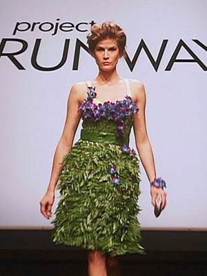
AJ's design, front

AJ's design, side

AJ's design, back

Overview: This was my personal favorite look of the night, which should come as no surprise to my most faithful readers. What do I love more than tight bodices with poofy, erratically draped crinoline skirts? Sure, AJ took quite a few pages out of the Marchesa/Vera Wang cocktail dress books in creating this design, but it’s nonetheless eye-catching and intriguing.

Styling: The hair is a bit too lopsided on top for my tastes, but still wild and ferocious. Perfect make-up, good shoes, and an absolutely killer necklace make this dress look more high fashion.

Idea vs. Execution: The back of the skirt is a big sloppy mess, but what more can you really expect in five hours? I think the fact that the bodice fits her well and the proportions are working is impressive, given the constraints.

Judges’ Vote: AJ was one of many middle-of-the-road entries this week, according to the PR judges.

Andy's design, front

Andy's design, back

Overview: It’s certainly daring and risky; the drama of Andy’s design reminds me of Christian Siriano. The outfit sort of works when the cape is on, but when it comes off, we run into some serious problems.

Styling: The dramatic hair, hair accessories, and eye make-up reinforce Andy’s message that this is SOMETHING TO LOOK AT. But whoever this woman is, I don’t see her wearing those cuffed boots.

Idea vs. Execution: Most designers can’t make pants in two days, let alone five hours. I think Andy deserves some probs just for making so many different pieces. But the fabric of the pants stretches oddly over the model’s crotch, and from behind, the effect is even worse. The pants are too tight and don’t flatter her butt, and I hate that little peek of flesh between the bottom of the shirt and the top of the pants; it’s incredibly distracting. And clearly the sloping hems of the back of the shirt were meant to look more symmetrical.

Judges’ Vote: In.

April's design, front

April's design, side

Overview: A near disaster, from styling to concept to implementation.

Styling: The hair (and, to a lesser degree, the makeup) scream 1986. Also, the side pony is not the best hairstyle for a model with the biggest ears since Dumbo. Seriously, those things are HUGE!

Idea vs. Execution: I don’t support anyone who thinks they can just turn a jacket inside out, cut off the sleeves, and say they designed something. I think the idea was lazy at best, and the execution was clearly a nightmare. Heidi said it best when she questioned whether the unfinished look is actually what April was aiming for, or if she just can’t sew. But even if you’re going for a deconstructed look, you have to construct something. This outfit has a slanted hem; that same hem is unfinished and stringy. The shoulders are frayed and unfinished, as is the neckline of both the dress and the jacket/vest. From the side view, we see that the bottom of the jacket/vest is also unfinished. So tell us, April… What did you finish?

Judges’ Vote: 6th from the bottom – Heidi called this look “a hot mess.” Bad enough to be in the bottom of the barrel, but the first one of the pack to be told, “you’re in.”

Casanova's design, front

Casanova's design, side

Casanova's design, back

Overview: Hello sideboob, my old friend. We’ve seen a lot of naked on the runway before, but outside of bathing suit, lingerie, and female wrestling costume challenges, this may be the most scantily clad model in Project Runway history.

Styling: Excellent hair and make-up – wild and natural, like the queen of the jungle this sexy woman must be.

Idea vs. Execution: If Casanova’s idea was to make a dress that no woman could possibly feel comfortable wearing in public, then he executed that terrible idea perfectly. In the episode, it seemed as if Casanova knew that this dress would be quite revealing – at least, he refuted Tim’s comment about it possibly being vulgar, which is exactly what it turned out to be. But putting aside the question of taste, I hate the way that fabric is draped in the back. There’s something very toga/diaper about it, and while the print of the bottom layer of the skirt is fabulous, the dirty, washed-out colors of the other fabrics are just ugly.

Judges’ Vote: Bottom 3. After kicking off the loser, the judges kept Casanova and Ivy on to torture them just a bit more, but eventually let them stay.

Christopher's design

Overview: Christopher was giving a good piece of clothing to start with (basically the entire patterned fabric of the dress), but dolled it up and edited it with a keen eye for detail.

Styling: Not loving the gold bag when the fabric on the dress is tan, and I think a summery shoe would have worked better. But none of it distracted from the look itself.

Idea vs. Execution: The top is a bit lopsided and not quite symmetrical, but the rouching of the collar was pretty nicely done and the belted element is well-made and flattering.

Judges’ Vote: In.

Gretchen's design, front

Gretchen's design, back

Overview: Simple but beautiful, elegant, conservative evening wear.

Styling: The lips and cheeks are far too bright, bordering on whorish. And those shoes definitely throw off the proportion of the outfit.

Idea vs. Execution: The fit is pretty excellent. When fittings are hurried, loose garments like this can just look baggy and saggy, but Gretchen did an excellent job. And the back of the skirt is very nicely constructed. The shoulder appliques look a little amateurish, but overall, Gretchen’s execution was very strong.

Judges’ Vote: Gretchen is the winner! Congratulations, darling.

Ivy's design, front

Ivy's design, back

Overview: Every year, there’s a loudmouth bitch I can’t stand, and this season the award already goes to Ivy. I hated her before I saw her lack of design skills, but once I realized that she, as Heidi repeatedly said, “made pants out of pants,” I was done.

Styling: Ivory purse, nude shoes, and white pants? No, no, no.

Idea vs. Execution: What idea? She made pants out of pants. You can rouch them all you like, but don’t pretend you actually designed any of that. In fact, the only part of the look Ivy did design was that God-awful top, which clearly has some serious construction issues. The front is just completely unflattering and poorly fitted. The bow in the back could be nice, if the hanging pieces of fabric were actually the same length. And what an unforgiving choice of fabric – it just puckers and wrinkles all over the place, particularly from the back.

Judges’ Vote: Bottom 3, but ultimately safe, along with Casanova. But in my opinion, Ivy deserved to go home.

Jason's design, front

Jason's design, back

Overview: Escaped mental patient goes to the hair salon? What was Jason thinking?!

Styling: Hard to say, since the outfit itself is so nonsensical. That over-the-top punk/whore look may work with some outfits, but it couldn’t save this train wreck.

Idea vs. Execution: Failure on both parts. Look at the second picture – doesn’t it just look like she’s wearing a kimono backwards? THAT’S BECAUSE SHE IS. If that’s not laziness, I don’t know what is. And the construction is even worse. Pins everywhere, awful seams, accidental asymmetry, and no shape to it whatsoever.

Judges’ Vote: 4th from the bottom. Saved by the bowler hat.

Kristin's design

Overview: Boring. Cute scarf, though.

Styling: Again, pretty boring. Not a fan of those clog-like heels or the Princess Leia hair.

Idea vs. Execution: Simple idea, fine execution. This is an example of how to best use deconstruction without looking sloppy – the scarf is frayed and unfinished, but the rest of the dress is much more tailored.

Judges’ Vote: In. You can leave the runway.

McKell's design, front

McKell's design, back

Overview: Tacky, tacky, tacky. One wrong choice after another, this dress is a textbook Monet. (Props to those who caught the Clueless reference.)

Styling: So bad, it was basically the reason McKell was eliminated. That hair is awful from the front and downright disastrous from the back. The pink purse is awful – the judges were right to call McKell out for her inability to style her model.

Idea vs. Execution: The idea was precious – even Tim agreed – but the execution was where she failed. The fit is wrong, the proportions are terrible, the front is much shorter than the back, we’ve got some sideboob issues… do I really need more?

Judges’ Vote: Auf wiedersehen, McKell. Enjoy Utah and your new baby.

Michael C's design, front

Michael C's design, back

Overview: It’s borderline prostitute wear, but it’s bold and has a point of view all the same. And just a general note – why do so many of these models have tattoos? Ladies, isn’t it your job to be a blank canvas? Isn’t it expensive for magazines and such to airbrush those tattoos out? I’m just surprised so many of them are donning ink; I’d think it would be more taboo.

Styling: Basic black accessories were a good choice, as was the simple and chic hair. Modern, funky, cool.

Idea vs. Execution: A tight black miniskirt isn’t exactly a novel idea, but it serves its purpose (though the seam in back is problematic). The shirt is okay from the front, but has some fit issues with the straps in the back. Not particularly well-made and not particularly innovative, but not a completely fuck-up, either.

Judges’ Vote: In.

Michael D's design, front

Michael D's design, back

Overview: I’m not sure who’s wearing this, but it’s certainly interesting and fairly well-made. At first glance, I had a strong distaste for it, but it’s one of those dresses where the more you look at it, the more you like it.

Styling: Minimalist in a good way.

Idea vs. Execution: I think this dress is executed quite well, particularly the hood/cowl piece in the back. I like that someone is utilizing such a strong Native American perspective – the beadwork, the colors, and the general effect is unique and quite lovely. The big, baggy sleeves are not my cup of tea, but otherwise, it’s a job well done.

Judges’ Vote: In.

Mondo's design

Overview: Unique fabric choice – I like the combination of the pattern with a surprising solid color. It holds my interest, even though the silhouette of the dress is quite simple.

Styling: Who still does pin-straight hair? But it does work for this outfit. The orange purse is a nice touch, but I’d have gone a little more low-key on the shoes.

Idea vs. Execution: Clearly, this has some execution issues. There’s puckering everywhere, and it seems uncomfortably tight in some areas and fairly loose in others. But everybody needs a basic dress in a funky color and print; with more time, I think this could have been something really interesting.

Judges’ Vote: In.

Nicholas's design, front

Nicholas's design, back

Overview: Oy. A hot disaster if there ever was one, I can’t get behind any part of this dress. To me, this is what the most evil brides in the world reserve for their bridesmaids – a dress no one, no matter how hot, will look good in.

Styling: Minimalist. Should’ve done a bit more – it’s quite empty.

Idea vs. Execution: The idea was brilliant: sportswear meets formal wear. But the execution was a total nightmare. From fit to fabric choice to proportions, this is just one sad sack of a dress. The only piece that works is the neckline; all the little sportswear features look far too craftsy and amateurish for the runway. And that length? A nightmare.

Judges’ Vote: 5th from the bottom. Saved from a worse fate because his ideas were strong and creative, even if he couldn’t implement them.

Peach's design, front

Peach's design, side

Overview: Hated it at first, but I’m coming around. Another cute, simple dress with nothing particularly interesting going on. Let’s just say these bitches better bring their A-game next week, because I’m not about to stand for any more simply little sundresses. But there’s not glaring problems with this garment. Except the model, who looks about 45. Seriously, Project Runway, how hard is it to find good models? Half these bitches couldn’t even walk. I’m five feet tall and I can stomp harder than them. Get it together.

Styling: The hair is simple, almost dated. I’d have gone a little more adventurous.

Idea vs. Execution: From the front, the execution looks pretty damn good, save for a few rough edges in the hemline. But the side angle shows that the red piping stops a little bit before the rest of the dress actually stops, which is a pretty glaring mishap. But the fit is nice, and the halter top is pretty great.

Judges’ Vote: In.

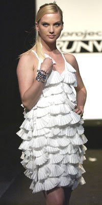
Sarah's design, front

Sarah's design, side

Overview: Another design that I hated at first glance, but am coming around to. Definitely a unique concept and silhouette with intriguing color choices. Like it or not, it certainly stood out on the runway.

Styling: Great. Casual but sexy hair, and I love the way the purple lipstick matches the purple shoes. Very nice touch.

Idea vs. Execution: You know how I feel about rompers, jumpers, and any kind of one-piece items, but this really is adorable. The short-shorts are super-flatting, and I love the flash of bright blue we see when the model turns to the side. The buttons on the sides of the shorts are super-cute, the jacket is well-made, and I’m really enjoying the proportions of it all, even though it’s so shrunken. But I think it’s definitely one of the better-made pieces of the bunch.

Judges’ Vote: In.

Valerie's design, front

Overview: It feels very art-school to me, which is basically the worst insult Tim Gunn can hurl at any given designer. Everything from the boob swatches to the color blocking feels a bit contrived and immature to me, but it’s definitely not hopeless.

Styling: Very basic, understated. A good choice, considering this is a busy dress.

Idea vs. Execution: There are definitely some glaring construction issues. The hem is quite uneven, the belt area is puckering, and the little boob-shields are distracting and not particularly body-conscious. But I do admire her use of color – not just color, but three different and unusual colors that we don’t often see together. And the zippers in the skirt are a very cute touch. This is another garment that I honestly believe could have been excellent, had the designers been given more time.

Judges’ Vote: In.


And there you have it, folks! Don’t forget to check back in on Saturday afternoon/evening for the weekly fashion recap. And follow me on twitter @democracydiva!

No more posts.