Project Runway: The Season 8 Scorecard

Are you keeping score? This Diva sure is! Let’s kick it back to the beginning of the season and compare which contestant I thought should be the winner and loser with who the judges picked! Feel free to play along – I’ll link back to the recaps of each episode so you can remember who YOU thought should be in and out. (Thank you to Lifetime for providing the challenge descriptions!) And at the bottom, we’ve got side-by-side pics of each finalists’ portfolios from the entire season! Let’s take a trip down memory lane…

Episode 1: And Sew It Begins

The designers must use a garment from another designer’s suitcase to create a new look.

Diva’s Winner: AJ‘s gritty-meets-pretty cocktail dress

Judges’ Winner: Gretchen‘s sheer-backed, cap-sleeved dress

Diva’s Loser: Ivy, for “making pants out of pants”

Judges’ Loser: McKell, for her tacky dress with even tackier styling

Episode 2: Larger Than Life

The designers must create a look that defines the Marie Claire woman. The winning look will be featured on a billboard in Times Square.

Diva’s Winner: Mondo‘s fabulous houndstooth skirt

Judges’ Winner: Gretchen‘s overpraised jumpsuit

Diva’s and Judges’ Loser: Jason‘s silver bathrobe and the bullshit symbolism that went with it

Episode 3: It’s A Party

The designers must design an outfit using party store supplies.

Diva’s and Judges’ Winner: Andy‘s heavy metal cocktail dress – and matching glove!

Diva’s Loser: Casanova‘s “transvestite flamenco dancer at a funeral” gown

Judges’ Loser: Sarah‘s blue and silver palm tree nightmare

Episode 4: Hats Off To You

The designers must design an outfit inspired by a Philip Treacy hat.

Diva’s Winner: A tie! Michael D‘s plunging avant garde top AND Valerie‘s cropped white vest

Judges’ Winner: Michael C‘s metallic wrap dress

Diva’s and Judges’ Loser: Kristin‘s black and pink disaster

Episode 5: There Is an “I” in Team

The designers are assigned to two teams and must create a six piece collection.

Diva’s Winner: Michael D‘s black lace cocktail dress with its breathtaking back

Judges’ Winner: Casanova‘s beautiful lace blouse (and divalicious breakdown)

Diva’s and Judges’ Loser: AJ‘s miserable shirt dress

Episode 6: You Can Totally Wear That Again

The designers must create a fashionable look from bridesmaids dresses.

Diva’s Winner: Mondo‘s black and pink mod/Jersey Shore dress

Judges’ Winner: Michael C‘s (super ugly) black cocktail dress

Diva’s and Judges’ Loser: Peach and her green ruffled skirt

Episode 7: What’s Mine is Yours

The designers must create a resort wear look. (Diva’s Edit: And construct each other’s designs!)

Diva’s and Judges’ Winner: April‘s black lingerie-inspired dress, constructed by Christopher

Diva’s Loser: Ivy‘s depressing top and giant pants, constructed by Michael D

Judges’ Loser: Casanova‘s grandma blouse

Episode 8: A Rough Day on the Runway

The designers must create an American sportswear look inspired by Jackie Kennedy.

Diva’s and Judges’ Winner: Mondo‘s purple houndstooth skirt and striped blouse (my personal favorite look of the season)

Diva’s and Judges’ Loser: Michael D and his Pilgrim skirt

Episode 9: Race to the Finish

The designers must create a high fashion look and a ready-to-wear companion to appear in a L’OrĂ©al Paris ad.

Diva’s and Judges’ Winner: Mondo‘s multi-print ballgown and fabulous RTW dress

Diva’s and Judges’ Loser: Ivy‘s ocean-inspired hurricane of ugly

Episode 10: There’s a Pattern Here

The designers must create an original fabric look using HP/Intel technology.

Diva’s and Judges’ Winner: Mondo, his beautiful soul, and his incredible print

Diva’s Loser: Christopher‘s forgettable top and pants

Judges’ Loser: Valerie‘s self-plagiarized plunging cocktail dress

Episode 11: A Look in the Line

The designers must create three looks for Heidi’s activewear line.

Diva’s Winner: Mondo‘s chic but wearable dresses and leggings

Judge’s Winner: Andy‘s skeletal loungewear

Diva’s and Judges’ Loser: Christopher‘s 11th consecutive snooze-fest

Episode 12: We’re in a New York State of Mind

The designers must create a look inspired by New York City.

Diva’s Winner: Mondo again, for another mixed-print cocktail dress

Judge’s Winner: Michael C‘s overpraised, slutty gown

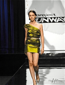
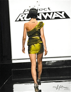
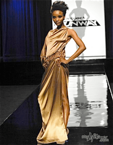
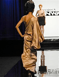
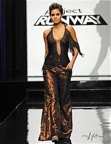
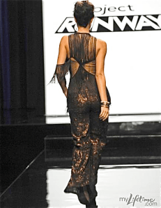
Diva’s Loser: Michael C‘s eight thousandth uncreative, uninspired, derivative dress (photo above)

Judge’s Loser: April‘s “pregnant witch” gown

Episode 13: Finale, Part I

The designers must create an 11th look for their mini collection to compete for a spot at Fashion Week.

Diva’s and Judges’ Winner: Mondo‘s mixed-print mini-collection, and his newest look in particular

Diva’s and Judges’ Loser: Michael C‘s derivative, slightly garish, poorly-constructed mini-collection

Episode 14: Finale, Part II

Guest judge Jessica Simpson helps decide the finalists’ fate and the Season 8 winner is finally revealed.

Diva’s Winner: Mondo, for a bright, creative, and truly unique collection.

Judges’ Winner: Gretchen‘s accessible, on-trend collection

Diva’s and Judges’ Loser: Andy‘s underwhelming collection of green and grey looks

By the Numbers:

Diva and Judges agree on 8/14 eliminations and 6/14 wins.

The Finalists’ Portfolios:


Gretchen's Looks, Episodes 1-12

Looking at Gretchen’s season portfolio as a whole, I actually don’t hate it as much as I hate some individual looks. Without the context of the challenge and the comparisons to the work of other designers from that episode, some of this really isn’t so bad. The party favor skirt (top row, 3rd look) is probably my favorite Gretchen design of the season; of course, its hipness and youthfulness stick out like a sore thumb against this sea of muted tones and draped fabrics. But the only other looks I find remotely wearable are the first look and her high fashion and RTW looks (2nd row, last two looks). The velvet dress is much more beautiful than I remember, though I still think there’s nothing high fashion about it. And the RTW look is fairly matronly, but I think that could be solved with better styling. Overall, I’m not as nauseated by her work as I thought I’d be, though the entire last row of looks is so unfortunate, it’s truly shocking that she made it to the finals.

Andy's Looks, Episodes 1-12

There’s a lot of inconsistency in Andy’s portfolio, and the only looks I like are the ones that go over the top, or “Warrior Bitch,” as Michael Kors would say. With the exception of his resort look (2nd row, 2nd look), the only garments I like are black, badass, and enhanced by leather or metallics. Like Gretchen, Andy shone in the party favor challenge (1st row, 3rd look) and the high fashion/RTW challenge (2nd row, last 2 looks). Also like Gretchen, basically everything else is underwhelming. It’s surprising that someone with this Asian-gothic-dominatrix aesthetic would put out so many sad girl/old lady looks – the Philip Treacy challenge and the group collection challenge (1st row, last 2 looks) and the make-your-own-print challenge (3rd row, look 1) are some of his biggest weaknesses because they veer so far from who Andy really is as a designer.

Mondo's Looks, Episodes 1-12

Mondo’s portfolio is the only one that truly feels like it reflects him as a designer, and it has more style, youth, personality, and attitude than Gretchen and Andy’s portfolios combined. His best work walks the fine line between wearable and cartoonish. He rarely goes astray because of not pushing the boundaries far enough – only in the first challenge (1st row, 1st look) did his work suffer from being underwhelming. Usually Mondo’s mistakes were from not editing down enough of his crazy – his Philip Treacy look and resort look (1st row, 4th look and 2nd row, 2nd look, respectively) just went too far. But unlike his competitors, the majority of Mondo’s work is beautiful and intriguing, and every single piece is identifiably Mondo.

© Democracy Diva, 2010.


Project Runway Recap: S8 E14 (The Season Finale!)

First off, get caught up on the entire season with my Season 8 Scorecard. Compare who won each challenge with who should have won, and analyze the season portfolio for each of the three finalists!

Back to the finale: We’re all angry, dear readers. That is undeniable. But let’s try to rein in our fury and judge these looks with an open mind, and try to forget how much we want to throw things at Michael and Nina.

In defense of Gretchen, Michael and Nina were correct that her design aesthetic is very trendy now. I personally do not understand the appeal of slouchy, oversized jumpsuits and similar relics of the 1970s, but you cannot deny that this aesthetic was all over the runways at New York Fashion Week. Michael Kors designed his Spring 2011 collection around a similar concept of relaxed, casual, wearable garments, so it’s unsurprising that he wanted Gretchen for the win.

However, the blogosphere is ablaze over Mondo’s loss, and rightfully so. His collection had an originality that Gretchen simply cannot match. His overall work in the competition, including his final collection, has been thought-provoking, joyous, and unique. I cannot say the same for almost anything that Gretchen designed this season. (Stay tuned for my post reviewing the entire season, and I’m sure you’ll agree.)

Was Mondo’s collection youthful, as Nina and Michael claimed? Absolutely. But since when does fashion have to appeal to an older customer? Average teenagers and twenty-somethings may not buy as much fashion as older women, but it is young women who inspire designers, and young women rock their looks on red carpets every day. Fashion is not for the elderly, or even the 30something crowd. Fashion is for the people who inspire designers and delight in their work. I think Mondo’s youthful aesthetic is one of the best things about his work.

We can argue for weeks over whether it was appropriate to judge this design competition over whose looks were more commercial, instead of whose looks were more creative or fashionable. The point is, even if we’re judging based on what Nina can sell, you can’t dismiss Mondo as un-sellable. He has an incredible commercial appeal that the judges are, forgive me, too damn old and stubborn to recognize. I’m sure there are many women who will be thrilled to wear Gretchen’s flowy jumpsuits, but there are just as many women who would kill for a Mondo original in their closet. And the fact that the judges neglected to comment on Gretchen’s offensive use of diapers was absolutely ridiculous. The parade of giant burlap panties should have been enough to auf Gretchen.

I could go on like this for hours, but let’s just start the show.

ANDY

Cool pieces individually, but the colors are practically unwearable, even though they’re very eye-catching on the runway. I don’t like the wiry headpieces – they look like cheap Philip Treacy knockoffs, and I think they are primarily responsible for the loss of Andy’s real vision throughout this collection. They substitute his usual Asian Warrior Bitch for some sort of Alien Fairy Queen; it’s not nearly as interesting, and it doesn’t feel like Andy. Furthermore, the judges were right to point out that you need to open with something much bigger and bolder than this.

As soon as this hit the runway, I said, “This is a throwaway piece if I’ve ever seen one.” There’s just nothing to this look – the jewelry is much more interesting than the clothes. If it were in brown instead of silver, I’d swear this was a design by Gretchen, not Andy.

I think the mismatched silvers and greys were very poorly chosen. I think that mix of colors is very unattractive. And I think the blouse is fighting with the jacket for attention, which is nearly always problematic.

The shorts seem cute at first, but I’m not sure I can really picture the customer who is wearing metallic olive green high-waisted shorts that make her look like she has a huge gaping vagina.

I can see too much vag, and Tim was right – it does look like pubes coming out of her bikini bottom. The robe helps, but not much.

I actually agreed with Jessica Simpson that this was Andy’s best look. I love the modern twist on a 1920s flapper – very trendy, wearable, and beautifully done. But this looks like a Laura Bennett creation, not an Andy South creation.

These pants are kind of cool, and I love the neckline to that blouse, but I think the ruffles are awful.

I want to like this, because I think it’s unique, but I just hate the way those shapes make her look. I don’t think Andy understands that the geometric aspects of the garment need to be not just interesting, but flattering. And the shoes are AWFUL.

The blouse is undeniably gorgeous, and I’m warming up to the pants, in spite of their strange vagina. (Once again, Andy can make things look interesting, but he doesn’t take a woman’s body into account.) I just don’t see how the top and bottom go together.

I love the top half of this garment. I think it’s a stunning shape and the handiwork on all that pleating is absolutely incredible. But the bottom is such a let down. First of all, the proportions are way off; that skirt needs to be two inches longer to counterbalance the top. And second, the bottom just seems like a cop-out after all the work that was clearly put into the top. It’s like he forgot about the skirt entirely.

GRETCHEN

The jacket is actually quite cute (although the colors are awful), but I cannot believe that Gretchen opened her show with a giant brown diaper. And the judges praised her for styling her the way they recommended, but I’m still seeing Southwestern Granola all over this. The giant platform wedges and center-parted wavy hair are not high fashion. And I think the necklaces look very elementary. Any first-year design student could have designed that jewelry.

Definitely a step up from the panty, but the accessories are still a nightmare. If Gretchen could just put a simple pump or Mary Jane or heeled sandal on a single model, it would improve things so much. But she insists on these bulky shoes that focus the eye on the woman’s feet instead of her clothes. I don’t hate this dress. I think the cut-outs on top are lovely, but I think she stole that shoulder-slit idea from April. But a mullet hem (longer in the back than in the front) is rarely, if ever, a good idea.

Once again, the accessories overpower the girl. Perhaps this is my problem with Gretchen – she tries so hard for this relaxed, effortless, reachable aesthetic, but her styling is anything but. It’s always chunky and huge, trying too hard, and it’s anything but relaxed. This is also a bit of a throwaway look, because the cut of the top is identical to the look before is, and the bottom is something she’s already done on this show. If the colors and prints are going to be this ugly, I at least expect the design to have some originality.

This seems so much more fashionable than her other looks, and I truly believe it’s because the chunky black shoes and bracelets are gone. The sunglasses and jewelry do maintain that Southwestern ease, and these colors are so much warmer and richer than anything else in the collection. I don’t know that anyone actually wants to wear those giant pants, but I think they’re beautiful to look at (except for the vagina), and the blouse is chic and effortless.

Another throwaway look – a diaper and a grandma sweater, styled terribly to boot. This was downright offensive – I can’t believe Gretchen got away with sending something so half-assed and designless down the runway.

Awful styling again, but this jumpsuit is pretty wearable. The fabric moved in a really fascinating way when she walked. I’m not sure I would want those pointy seams around my hips, flapping in the wind, but I suppose it looks good on a size zero Amazon woman.

What does this have to do with the rest of her collection, besides the fact that she’s wearing a diaper?

And I thought the judges instructed her to put her models in heels (like every other model on every other runway in the universe) instead of flats? Things can almost never look high fashion on the runway without high heels. They just make the model walk in a completely different way – there’s no replacing that.

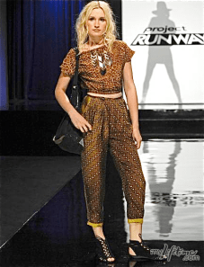
Those prints together are an absolute nightmare, and I don’t know who the hell is wearing cutoff midriff-baring tees these days. And again, the pants flapped down the runway in the most peculiar way. They look fine in a photo, but their movement is just bizarre.

I know this look is supposed to tie in the black jacket with the rest of the collection, but I still don’t think that fabric makes any sense here. And that shirt is just ugly.

By far my favorite look of the collection, and definitely the best to close with. This isn’t quite a showstopper, but it’s as close as Gretchen is going to get. It’s obviously not something that you could ever wear as evening wear, but it steel feels much dressier and more formal than the rest of the collection. So it seems this is Gretchen’s vision of formalwear. I’d never wear it as such, but it makes a beautiful day dress.

MONDO

It’s interesting that Nina felt Mondo’s looks needed to be edited down, and yet this was one of her favorites. If any look needed to be watered down a bit, it was this. The blouse, scarf and shorts were a lot to begin with. The belt gave it a fun pop, but Mondo should have nixed one, perhaps even two, of the loud accessories. They were incredibly distracting.

I didn’t notice these little robot shoes on first glance, but I think I hate them. Regardless, the blouse and shorts are funky, beautiful, and wearable. The styling is over-the-top, but only in a “That’s Mondo” sort of way and not at all in a circus show way.

This is probably what gave the judges the impression that this collection was too youthful, and I understand that. Few women who are beyond college age would really be able to rock this look. But I truly believe that these pieces, while wild, are wearable by real women as separates. I think those leggings would be unbelievable with a super-short black dress, and you could throw on skinny jeans and boots with that shirt and look totally badass. The judges took these pieces too literally and refused to see their potential off the runway and on the streets, but I stand by Mondo.

Still one of my favorites of Mondo’s collection. Just enough design elements to keep you on your toes, but it doesn’t cross the line into costumey. I think it’s a brilliant use of color.

This was a favorite of the judges, but more importantly, it was the favorite of everyone who I watched the show with. This is the reason Betsey Johnson loved Mondo’s collection – it’s very Betsey-influenced without feeling copied. A strapless poofy plaid bubble-skirted cocktail dress with pockets is something I would absolutely kill to have in my wardrobe. And those stockings are absolutely delicious. I like the pop of yellow in the shoe, but I wish he’d gone for pumps instead of booties. We thought this look guaranteed Mondo’s spot as the winner.

This is deceptively simple from afar, but totally beautiful in a close-up. The sequined, patterned top is seriously amazing. I can picture so many different kinds of women incorporating that blouse into their wardrobe. And those shorts look pretty badass, although I’m not sure how comfy I’d be in high-waisted black leather shorts.

These pants are nuts, but I love them. I can see the arguments about their unwearability, but I can’t deny that they look kickass on the runway, especially with that jacket. I wish he’d nixed the long sleeves, and I think the shirt is too busy with those pants, but it’s not a bad look overall.

Another favorite. I had found the full-length polka dot dress to be too much; I agreed with Michael that it needed some skin to balance it out. And this was the perfect balance. These pieces are totally wearable as separates, and look incredible together. Again, I think he could have stepped down a bit on either the jewelry, the headpiece, the purse, or the shoes, but the clothes are beautiful.

Everybody loved this but me. I think it’s totally 80s, and not in a good way, and I think it’s the only piece that gives the collection too much of a youthful vibe. I think the judges loved it because unlike many of Mondo’s pieces, it wasn’t overstyled, but I thought it was too simple and too junior.

This has grown on me since last week, but I still think it’s so awkwardly long. I think if it stopped at the knee, it would be a total knockout. But those shoes were an absolute mistake.

So, congrats, Gretch. I won’t lie and say you deserved the win, but I suppose disco granola girls need to get their diapers somewhere. But let’s hear what you think:

And your results from last week’s episode:

Don’t miss the Season 8 Scorecard, a guide to this past season of Project Runway!

© Democracy Diva, 2010.

Project Runway Recap: S8 E13

What can I say, dear readers? The end of another unfabulous season is upon us. Underwhelmed doesn’t begin to describe how I feel about these designers. No one truly knocked it out of the park, and most of the looks on the runway were complete garbage. And we can argue over Gretchen vs. Michael C for hours, but we all know the truth: Only Mondo truly deserves to be at Fashion Week. (Actually, I’d argue April deserves it as well, but that’s a moot point). I’m disappointed by the lack of oomph in these looks. The judges were right to question the designers on why the hell they wouldn’t show their tip-toppiest looks in this challenge. This is the time to truly bring it, and nobody did. Let’s start the show.

ANDY

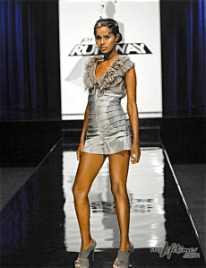
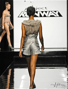
This isn’t terrible, but it’s not Final Collection worthy. It’s over-designed – the ruffles on the neckline, and the rouching in the back, and the pleating and the curves – all in a romper? It’s just too much, and more importantly, it’s neither wearable nor high fashion. And if it’s neither, then who the hell is going to care about it? Not this Diva, that’s for sure.

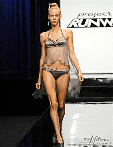
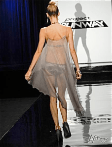
Honestly, I respect Andy’s work, but I would have sent him home for sending this piece of garbage down the runway. Seriously? These people are giving you the opportunity to present your collection at New York Fucking Fashion Week, and this is what you’re showing as your best work? An ill-fitting unoriginal BIKINI and a sheer cape? This isn’t just bad design; it’s pure laziness. You’re going to have to wake up earlier than this to impress us, Andy. You’ve been warned.

I go back and forth between hating and loving this color. I think it’d be great as an accent color, but to do the whole look in this metallic green is a bit insane. The proportions are off, and this look, like the first one, is over-designed, under-constructed and not particularly beautiful. And the hats are cheap Philip Treacy knock-offs.

GRETCHEN

I don’t hate this. Honestly, if it had been in any fabric other than this truly horrific green potato sack cloth, I think I would have liked it. I like the exposure of the pattern from the front – I think it’s very funky and modern for Gretchen. I love the straps in the back, and although the pulled-up hem is definitely out there, I think that’s a good thing. Unfortunately, Gretchen has no taste, and so this is just another miserable little granola dress, when it could have been anything but.

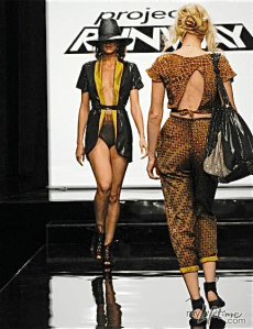
This personally offended me. How could someone who calls herself a fashion designer look at this and think it’s a job even remotely well done? The mix of patterns is awful; if she’s trying to be Mondo, she’s failing miserably. The pants are so far beyond unflattering, it’s almost absurd. The model’s ass looks absolutely gigantic, like it’s twice the width of the rest of her body. The mustard yellow cuffs are ugly, and that shirt? Look at the back of that shirt! How dare she send something that unfinished down the runway. And if all your models are going to be wearing the same shoes, at least have them be cute. These are disgusting, and Nina was right: these women are on a runway. They need to be in heels, not Birkenstocks.

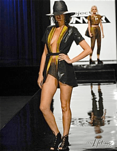
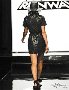
If there was a challenge to do a modern take on a Rocky Horror Picture Show character, and Gretchen chose Columbia, I think this would have been fantastic. Unfortunately, she thought it would be a good idea to put a black and mustard tuxedo jacket and giant underwear together as an allegedly fashionable look; for this transgression, there is no forgiveness.

MICHAEL C

This dress sums up Michael C perfectly: Sometimes he gets lucky and picks a fabric that moves really well, even though he did absolutely nothing to make it into anything more than a piece of fabric. Usually the designers cream their pants over his genius ability to let the fabric speak to him (read: he doesn’t know how to sew), but he finally got called out. Because this is boring and derivative; it’s under-designed and poorly styled. Look closely at the fabric where the slit is – that hem, both on the side and on the bottom, is a disaster. It looks like it’s safety-pinned. And I’m shocked the model didn’t trip on all the excess fabric billowing around her ankles. But what did Michael really do here? Because from what I can tell, he threw silk on the model, put a belt on it, added a strap, and called it a day. And that is not designing.

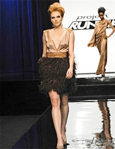
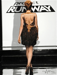
I’ve seen this dress a hundred times on the runway, and this could only pass for a Forever 21 knockoff of the real deal, at best. The top does not even come close to fitting her; further proof that when it comes to actually sewing, Michael does not have the skills of the other designers. And that feathered bottom is a mess. There’s no order or shape to it; the silhouette is sloppy and she looks like Snuffleupagus from the back. And the hair? What woman under 50 does her hair like that?

Of course Heidi liked this shirt, which is probably the sluttiest shirt I’ve ever seen. And these pants are so ugly, I’m surprised Gretchen isn’t wearing them as we speak. Because that bitch loves her some ugly pants.

In Michael’s defense, he did show a full-length gown, a cocktail dress, and separates, which is the formula you basically have to follow when presenting three looks out of your collection, because it shows the most diversity. Unfortunately, his diversity was still butt-ugly, practically plagiarized, and horribly constructed. Good riddance, Michael and your ridiculous overwrought, embarrassing emotions. (Seriously, what was his temper tantrum about? HE KNEW HE WOULD STILL BE SHOWING AT FASHION WEEK. TEN OF THEM DID. In light of that fact, doesn’t he seem just… completely fucking nuts?)

MONDO

It’s almost entirely black and white, but still incredibly Mondo. The prints are mixed beautifully, and the flashes of pink in the accessories really pump up the volume. Extra points for showing a real head-to-toe look: a head piece, separates, shoes, belts, bags, you name it.

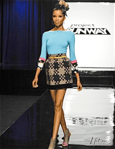
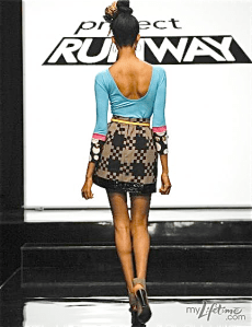
I couldn’t believe this was the look he threw together in two days, because after viewing Mondo’s collection weeks ago, this look was one of my absolute favorites. That color blue is amazing, especially with that unexpected mocha-and-black skirt. The sleeves are delightfully fun, and the yellow belt really made it all come together.

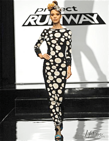
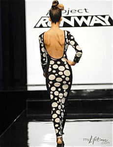
But I could not get behind this. It looks better in these photos than it did on my television, but the combination of the stretchy fabric and the different-sized circles was a mistake. It just gave the appearance of the dress stretching out her features, making her hips and butt much wider than they actually are, like an optical illusion dress. And is this supposed to be formalwear? It’s a full-length, long-sleeved, low-backed dress, but I can’t imagine anyone actually wearing this as evening wear. I’d have preferred it if it went to the knee, and the sleeves went to the elbow, and it was made of a less-stretchy, sturdier fabric.

But forget about me, dear readers. What do you think?

And of course, your results from last episode’s poll:

© Democracy Diva, 2010.

Project Runway Recap: S8 E12

This episode proved definitively that the heyday of Project Runway is behind us. Everything about this week’s episode, from the overly dramatic, scripted soundbites to the illogical and unreasonable judging, reeked of producer influence and behind-the-scenes pressure. Either that, or the judges are hitting their crackpipes harder than Amy Winehouse. But regardless, this was an episode full of disappointments. Let’s start the sad, sad show.

ANDY (Inspiration: Central Park)

Compared to the garbage on the runway, this wasn’t a bad entry from Andy. But it wasn’t what I consider worthy of the penultimate challenge. Andy has done this dominatrix, mixed-black fabric and a single black glove thing repeatedly through out the season but somehow he gets applauded for his strong point of view and interesting use of black-on-black, while April is lauded as a one-note. Really, judges? Why is Andy allowed to recycle his ideas, but not April?

Furthermore, what the hell about this dress evokes Central Park, exactly? I’m not sure how he got to this dress from that inspiration. If I were in the judge’s circle, Andy would have snagged the #3 spot based on his entire body of work this season, and maybe #2 based on this challenge alone. But that’s just proof of the lackluster designs in this episode and this season overall. I think Andy is a decent designer, but not a great one, so he scores a spot in the finals from me only by relative talent.

Oh, and kudos to Michael Kors for his totally spot-on Robert Palmer music video reference!

APRIL (Inspiration: Brooklyn Bridge) – Eliminated

Did this look like some of April’s other work? Yes. But aside from the use of black and a general dark princess vibe, the only look of April’s that this garment really looked like was her resort look for episode 7. The rest of her designs could probably be in the same collection as this, but they don’t actually look significantly similar to this. Even her resort wear is only similar in the use of cutouts, not in the silhouette. I don’t think this is the most wearable or flattering gown, but I respect April for doing her own dark version of a ball gown, and I think she had some beautiful ideas. She’s been my second favorite designer throughout much of the season, and I think she’s an incredibly talented woman. You can see her creativity and unique vision shine through this garment, and that’s much more than I can say for some of the finalists. For this challenge, she’d have taken my #3 spot – and I would have only let three on to Fashion Week, because I’m a bitch like that.

GRETCHEN (Inspiration: Lower East Side)

It was a pleasant surprise to hear the judges finally critique Gretchen instead of blindly praising her, but of course she still made it to the finals in spite of this bullshit outfit. This looks better in photographs than it did on television, but as one of the judges put it, this garment reeks of off-the-rack. It’s just inappropriate for what is allegedly a design competition (though I’d argue that it stopped being one when the show left Bravo for Lifetime) – it’s boring, cheap-looking separates that lack cohesion and vision. To put it simply, it’s clothes, not fashion.

I’ve never hid my hatred for Gretchen and her hippie-disco-granola aesthetic, but this was laughably bad, even for her. And most glaringly, this has literally nothing to do with the Lower East Side. This is further from the LES than Andy was from Central Park. Gretchen ranks #4 out of 5 on my list – no Fashion Week for you in Diva Headquarters, Gretchen.

MICHAEL C (Inspiration: The Statue of Liberty)

I prayed that this would look better in photographs than it did on television. I prayed that it was a mistake, or a prank, or I went temporarily blind while this look went down the runway. But my prayers have gone unanswered, because this is still the textbook definition of a hot disaster.

Let’s begin with the slit. If I can see the curvature of your ass, your slit is too high. I’m sure you could see this model’s fire-crotch from a certain angle. And the back? My friends and I literally gasped with horror when she turned around. I don’t think I’ve ever seen a model’s back look that ugly before. I didn’t even KNOW a dress could make your back look fat until I saw this look. But leave it to Michael to know absolutely nothing about what’s tasteful or what looks good on a woman. Furthermore, you’re doing a high slit, backless, and borderline ass cleavage? How is this a brilliant design when far more modest looks have been deemed “slutty, slutty, slutty” by Princess Kors? And can I add that there is nothing more cliche than a) taking your inspiration from the one New York landmark that IS ALREADY WEARING A DRESS and b) designing a solid-color, plain draped dress “inspired by” (re: copied from) Lady Liberty’s toga. Seriously, this was the best idea in your bag, Michael? Are you kidding?

Is the draping aesthetically pleasing? Sure. But is this dress in any way complex, creative, original, thought-provoking, daring, or high fashion? Not even close. And if this show is going to reward barely skilled copycats over designers with talent, vision and originality, then my days of recapping, and my years of devotion to Project Runway, may be over.

MONDO (Inspiration: Brooklyn Bridge)

Another adorable and chic entry from Mondo, who would have taken my #1 spot. But honestly? This disappointed me a little. If anybody stayed in their comfort zone and stuck to their own aesthetic on this challenge, it was Mondo. He just can’t get in trouble for it because what he does really always does feel fresh and new and exciting. But this resembles more of Mondo’s past work than April’s dress resembled her past work. No doubt that this dress is totally fierce, but I wanted Mondo to surprise me and show us something he’s never done before. I wanted him to show the judges that he wasn’t resting on his laurels and his three consecutive wins and generally favored status to get him through this challenge – I wanted him to pull out all the stops, and he didn’t. But the boy knows how to mix prints and how to style, and he’s got his finger on the pulse of what’s modern and stylish. And for that, he deserves to show at Fashion Week.

So now it’s your turn to decide who’s in and who’s out!

© Democracy Diva, 2010.

Project Runway Recap: S8 E11

Alright, let’s just say it: This episode SUCKED. Remember last week, when the judges finally bitched out the contestants for making clothes instead of fashion? Well, in their omnipotent brilliance, the producers decided to water the design competition down to activewear, which is about as far from last week’s “THIS IS A DESIGN COMPETITION!” as you can get. I don’t know what was sadder – the fact that having your sweatpants sold on amazon.com was supposed to be a reward, or the fact that Heidi Klum has an activewear line on amazon.com. But you know what was sad? Everything in Heidi’s collection, and everything the contestants designed. Because, guess what? No one gives a shit about activewear. Or Heidi as a designer. Or the eliminated designers who returned to make drama, and I guess some clothes.

Yes, Ivy took this challenge as an opportunity to accuse Michael of cheating – in the workroom, of all places, and in front of other people – and then went to each other individual designer to gossip about it. I wouldn’t put cheating past Michael C, but I think if the designers had really caught him cheating, they would have called him out when it happened just to get him thrown off the show. Why wait until weeks later when no one can do anything about it? That’s just not good strategy. He probably did cheat, but I think the ladies are lying about having seen the alleged boob tape first hand. I think the other models saw it and tattled to the other designers, who knew that without firsthand proof, the producers were not going to give a shit. But 90 minutes of bad designs and Ivy’s bitterness? Ugh. Anyway, expect my comments on the individual looks to be brief, because there’s nothing interesting to say about clothes that aren’t interesting. Let’s just start the fucking show.

ANDY – Winner

Andy’s 1st look was a moderately cool sweatshirt and a boring pair of leggings. Cute by soccer mom standards, but not particularly fashionable.

Lord, do I hate those pants. And I know over-sized is a look, but this just looks sad.

This is the look that won Andy the challenge. Comfortable but sexy with a little style to it. I like the skeletal vibe, but I agree that when paired with the other looks, it gets a little Halloween-y.

APRIL – Top 3

This looks better in photos than it did on television, but I still think it looks too much like a robe. I love the piece on her left shoulder, but I hate the way the fabric hangs on the right one.

Awful from the front – in fact, one of my least favorite looks from this episode and one of April’s worst this season. But the back of that jacket is darn cute.

If you took away exposed zippers and giant panties, I think the models for half the garments made this season would be walking down the runway naked. Here’s another case of the granny panty, paired with a shirt that has absolutely no design to it whatsoever. April, don’t let me down, girl. You’re funny and kind of a bitch and you curse like a sailor, and you’re talented beyond your years. Don’t fuck this up!

CHRISTOPHER -Eliminated

The judges finally stopped staring at Christopher’s beautiful face long enough to realize that he hasn’t made anything interesting yet this season, and so our favorite cutie has finally been cut. I can’t say he didn’t deserve it – these looks were dreadful and his track record is less than excellent. And this look is ugly, ugly, ugly.

The top half screams tween at a mall, the bottom is just insane. I can’t imagine the woman who’d want to wear this (and that includes women who shop for activewear on amazon.com).

Probably the ugliest dress in the world, but you know what? It’s totally hipster-ugly-cute enough to be my new favorite sleep shirt. And who doesn’t want to take Christopher Collins to bed with them? (Sorry, Nate!)

GRETCHEN – Bottom 3

I didn’t hate this nearly as much as the judges, though I agree that it’s a bit of a hot mess. I actually thought the skirt-over-biker-shorts concept was kind of clever and sexy, if a bit impractical. The rest of the look is garbage, which was surprising. Everything Gretchen makes looks like activewear that should be sold on amazon.com, so I can’t believe she fucked up this challenge so badly.

Maybe this what caused the judges to hate on Gretchen’s so-called 80s dance party collection, but I kind of liked this look. Cropped tops are back, at least in the Spring 2011 collections, and while I don’t think Gretchen was necessarily prophetic in creating this little cutoff tee, I still dig it. I’m not sure why all her pants have to have bibs on the front or back, but these were less offensive than most of her previous creations. And I like the shoes.

Dreadful. A bathrobe over a glorified towel over tacky leggings. As wrong as wrong can get.

MICHAEL C – Bottom 3

The episode aired days ago and I’m still personally offended by how ugly these pants are in fit, cut, and color. Who wants pants that mimic saddlebags? And the slouchy top and sweater are so depressing. But clearly the styling was the cherry on top of this pumpkin pie (forgive the mixed metaphor). The judges were right to point out that all the giant, clunky belts and shoes and the stick-straight hair are, like, totally over.

More ugly pants. More ugly sweaters. I don’t think I can take much more of this.

Michael could have thrown twenty belts on this and it still wouldn’t have hid the fact that it’s a complete piece of shit and fits like a cardboard box. AND DID YOU NOTICE THE EXPOSED ZIPPER? I think Michael’s collection angers me more than Pretty Christopher’s, because Michael is so unlikeable and Christopher is as loveable as a mini Australian shephard puppy (shout out to Chloe, new puppy of Jill, the Diva’s old roommate), but I still think Christopher deserved the auf’ing. But if Michael’s not next to go, I’ll eat my hat.

MONDO – Top 3

Let’s get ready to MONDO! I knew the judges were never going to give Mondo four wins in a row, but his looks far outshone Andy’s. The top is beautiful and trendy, the leggings are super-sexy and a great fit, and the headband says, “Try as you might, you can’t edit down MONDO, BITCHES!”

Another funky shirt, cute leggings (great color and GREAT length – that middle-of-the-knee hit is unique and flattering), and another fabulous, Mondo-riffic headband.

And this blouse really is where activewear meets fashion. You really could wear that to yoga and still look bangin’ walking down the street. The hair is laughably terrible, the headband is my least favorite of the three, and I pity the designers for having such an awful selection of shoes to choose from, but in spite of that, this was a pretty great entry from future Project Runway winner Mondo Guerra (at least, according to this Diva).

Please check out my Red Carpet Predictions from the Spring 2011 Collections! I’m taking all the most fabulous gowns from the latest runway shows and predicting which of your favorite celebs will be wearing them. It’s so good, it got plagiarized!

© Democracy Diva, 2010.

Project Runway Recap: S8 E10

What an episode! I was prepared for this week’s challenge to be dramatic and feelingsy, but it was truly emotional and even inspirational. You’ve just got to watch it for yourself to understand how moving it was, but Mondo has transformed from a quirky but talented tap-dancing designer to an honest and brave soul who knows how to find inspiration in life’s blessings and curses. The best part? Unlike most Project Runway drama, this didn’t feel scripted or over-produced. It just felt raw and real.

But enough about the feelings – we’re here to talk about the designs. This week, Project Runway brought back a terrific challenge from last season, giving the designers the opportunity to create their own prints. No twists and turns – just prints (and feelings). So let’s start the show!

Andy – Bottom 4

This late in the game, there’s no excuses. I don’t care if you’re distracted by your family or your feelings or your personal life – you can’t just give up on a challenge the way Andy did yesterday. Andy hasn’t always made the best choices in this competition, but until this challenge, he stayed true to himself. You could feel Andy’s spirit in every design. But this outfit lacked the vision that makes Andy unique. And Nina was right – this, like too many other garments on the runway this season, is clothes, not fashion.

Andy is at a disadvantage because of his truly awful model, but that’s also no excuse. That mullet blouse was uninspired and unflattering, that vest is disgusting, and those shorts make her look thick-thighed and not at all fashionable. And the print? Sad, boring, and unoriginal. I wouldn’t have eliminated Andy simply because of the strength of his prior work, but if I were basing my decision solely on this challenge, Andy would have been the sure loser.

April – Top 3

Another dark, sexy and intriguing look from April, who I love more and more every week. I like that she’s rough around the edges, with her gloom-and-doom aesthetic and general badass attitude, but she is clearly a gentle soul with a good heart underneath it all. This print, based on her parents’ divorce when she was 13, was stunning. The tree going up the model’s arm is beautiful and very unique, and her incorporation of the print into the design was rather brilliant. I love the silhouette and the styling, and I respect April for being the only designer besides Mondo to create real fashion for this challenge. She was my choice for the runner-up.

Christopher – Bottom 4

Christopher’s designs get more boring every week, and this garment is living proof. The print looked pretty cheap on the runway, but it’s even worse in close-up. It lacks emotion and personality and just looks incredibly amateurish. It’s my least favorite print of the group. I keep being stunned that Christopher is sneaking through when the judges admitted that there’s nothing memorable in his portfolio from this show. I’m still hoping he’ll turn it around and churn out something awe-inspiring, but if he’s planning on pulling out all the stops, I hope it does it soon.

Gretchen – Top 3

I hate the colors. I hate the print. I hate the cut of the shirt. I hate the ruffly collar. I hate the butt-flap on the pants. I have HAD it with Gretchen’s “disco-earthy” (aka “dated-matronly”) aesthetic, her over-confidence, and the judges’ refusal to critically view anything she designs. Nina gave her a “you can do better” speech, but it was more of a “you’re so amazing that we know you can do better” speech rather than a “step up your lousy fucking game” speech. And which one of the crack-smoking judges said that Gretchen is by far the best stylist of the group? That’s the furthest thing from the truth. Mondo is clearly the best stylist, with April riding close behind him. Gretchen has some strengths, but I really don’t think styling is one of them.

Michael C – Bottom 4

Oh, lord. Is Michael C still in the competition? I wrote him off so many weeks ago, I get frustrated just having to look at his face. This print is almost as bad as Christopher’s, and this design was downright ridiculous. As always, the styling is as dated and tacky as can be. So even though we still don’t actually know who Michael is as a designer, because everything he makes is completely derivative and lacking in any sort of originality, HE’S STILL HERE. Because although he’s never the best and usually pretty terrible, he’s also never the worst.

Mondo – Winner!

Incredibly moving inspiration aside, this look was the clear winner. I’m happy the judges said what they did about this outfit before Mondo told them his story, proving that they loved it as fashion AND as a message. Nina and I made the same moaning noise when the model took off the jacket, revealing that fabulous polka-dotted lining. The blouse is draped perfectly, and those pants are simply fantastic. Yes, they’re crazily high-waisted, but they look incredible and fit like a glove. Mondo truly is a master at the art of mixed prints, and he is deserving of his third win in a row.

Valerie – Eliminated

This was far from the worst of the week, but copying your own design from earlier in the season in such a half-assed way is definitely a dealbreaker. Valerie deserved the auf-ing just for thinking she could get away with such shenanigans. Valerie was sweet and talented, but she let the pressure of the competition get to her too early on, and she lost her way. (This is the direction Andy is headed if he doesn’t get his head together.) I don’t think the print was as bad as the judges thought it was, but it certainly wasn’t my favorite. I feel that this garment is over-worked, over-designed, under-edited, and far too stiff and unforgiving. Other than that, I didn’t mind it, but sweet Val got what was coming to her after several consecutive weeks of unimpressive looks.

Need more fashion? Of course you do! Check out my coverage of New York Fashion Week, plus the best looks from Milan Fashion Week and London Fashion Week! For more updates, follow me on twitter @democracydiva.

Project Runway S8 E9

Okay, who else is ready for the “Shocking Twist: MAKE MORE STUFF! WITH NO EXTRA TIME!” gimmick to be up? I understand the contestants need to be challenged, but if you expect someone to make a high fashion gown, at least give them more than a day to make it. It’s not about being kinder to the designers – it’s the simple fact that everything on the runway looks like shit when the designers run out of time. Throwing a ready-to-wear look on top of the challenge just decreased the quality of every garment.

And is it just me, or is a total oxymoron to instruct the designers to create a high-fashion couture look… to advertise an $8 eyeshadow? I get that the winner’s $20,000 needs to come from somewhere, but please. Don’t pretend something in a L’Oreal commercial is going to be Parisian couture. It’s an insult to your viewers.

Alright, I’ll shut up. Let’s start the show.

Andy – Top 3

Couture:

I absolutely loved this when it first went down the runway, but the more I look at it, the less impressed I actually am. I still love the fact that Andy made pants, and more importantly, pants that fit well. Christian Siriano is basically the only other designer in the show’s history who can actually construct a pair of pants. At first I appreciated how over-the-top it was, but viewed in photos instead of on TV, it’s basically a bunch of fan-like objects placed on top of an ordinary black suit. And that feels like a bit of a cop-out to me. But Andy has stood by his point of view week after week, which I respect. And in the hot mess on that runway, his stuck out as one of the few with any creativity whatsoever. He’d still have made the top 3 in my judging, but only because everybody sucked this week.

Ready To Wear (RTW):

Sexy, simple, and relatively well-made, considering the constraints he was under. It feels a little Gaga, which I love.

April – Safe

Couture:

I feel like I should be sick of April’s goth-chic aesthetic by now, but I’m not. It doesn’t make for great television, because it’s hard to see the details in all her black outfits, but when you review them in photos, each garment is intricate and unique. I’m digging the leather-and-lace train in particular. It’s like Lady Gaga meets Twilight, which sounds like it should be terrible but actually sort of works! It’s not exactly couture, but it’s intriguing and creative, and for that, I’d have put April in the top 3.

RTW:

Like Andy’s RTW look, April’s dress doesn’t move mountains, but it’s cute enough and isn’t falling apart at the seams. I hate that necklace, though.

Christopher – Safe

Couture:

I didn’t hate this when I first saw it, but I hate it more every minute I look at it. The white draping around her waist is sloppy and unflattering, and in the immortal words of Michael Kors, it looks like she’s pooping fabric. That dirty rose water pink is awful, as is the “nude” underlay that clashes horribly with the model’s skin tone. The shoulder piece is nice from the back, but a little underwhelming from the front. But the hair and makeup really drag this down into the dumps. Christopher seems like a wonderfully sweet person and a good designer, but he may just be too boring to continue much further on the show.

RTW:

Oof! That is some sloppy sewing. The dress is only slightly more boring than April’s and Andy’s RTW looks, but the snooze-worthy fabrics and truly shoddy construction make it seem like a much hotter disaster. And I’d have put him in the bottom 3 for two poorly made and drab-colored garments down the runway.

Gretchen – Top 3

Couture:

Since this season began, I’ve never liked anything Gretchen designs as much as the judges praise it. Sometimes it’s just a matter of personal taste – the 1970s aesthetic that’s all over Gretchen’s mind and the New York Fashion Week runways right now is really not my style – but sometimes, I just want to tell Michael, Nina, and Heidi to put down the crack pipe and open their eyes. This is ugly, dowdy, matronly, and not even remotely couture or high-fashion. I don’t think it feels expensive or chic, and the back, which the judges creamed their pants over, looks beyond tacky to me. I’ll concede that the feather work is nicely done, but this is not a garment that a real woman wants to wear.

RTW:

Gretchen, I’ll give you $20,000 myself if you just make something that doesn’t feature a slouchy sweater, oversized sleeves, or droopy fabrics of any kind. Gretchen’s strong construction skills would make me judge her as safe, but no way in hell would she be in the top 3 if I were in the judge’s circle.

Ivy – Eliminated

Couture:

Well, it was about damn time. Ivy’s been churning out ugly after ugly since the beginning. But I must say, even I could not have anticipated just how ugly this was going to be. I knew the colors were tacky, the concept was too literal, and it wouldn’t be remotely high fashion, but I didn’t think it was going to look THIS bad.

RTW:

And THIS was so bad, it was almost funny. The lack of a hem, the so-called draping, that awful neckline – I’d have sent Ivy home for either one of these looks, and she solidified her fate with two equally horrible garments.

Michael C – Bottom 3

Couture:

Before I noticed the wire hem, the never-ending train and the way the Bordeaux fabric shimmers, I didn’t hate this. I thought it was so derivative of Christian Siriano and other similar designers that it was practically copyright infringement, but I didn’t think it was ugly. But those three details (hem, train, shininess) killed it for me.

RTW:

Again, it’s every Alice + Olivia cocktail dress that Barneys sells, proving once again that Michael C has not an original thought in his head, but at least I could see a young woman wearing this. I actually would have made Michael C safe, not thrown him in the bottom, but I swear if I see one more zipper on this fucking runway, I’m going to lose my mind.

Mondo – Winner!

Couture:

I didn’t love the front, but this was by far the best look on the runway. I hate that the bodice sits so far away from her chest, and the black satiny fabric he used for the front looks cheap and tacky, but the back is simply stunning. I agree with the judges that the length is a problem (too short in front, too long in back), but the back of this dress is the only thing on the runway that I would call high fashion. As always, Mondo mixes prints and colors with impeccable skill, but what amazes me is the geometric, architectural shapes to this skirt. It’s not simply draped in back – it’s practically origami folded in such a complex and beautiful way.

RTW:

Simple and chic, but supremely body-conscious and much more show-stopping than any of the other RTW looks. If his win wasn’t solidified with the couture dress, this certainly would have given him the win in my book.

Valerie – Bottom 3

Couture:

Oh, lord. This dress is as basic as basic gets. The only actual design aspect is that sad little shoulder piece; the rest is an endless nightmare of white. Did she really think she could just wrap white fabric around her model and call it a day?

RTW:

I still get queasy just looking at this hot mess. It certainly gives Ivy a run for her money in terms of suckery. Valerie should thank her lucky stars that Ivy screwed up so badly, and she should watch her back, because if she doesn’t make a 180 soon, the judges are not going to forgive her.

Up next: London Fashion Week! Milan Fashion Week! And so much more. Stay updated on twitter @democracydiva.

Trannies & Cameltoes: The 10 Worst Looks from New York Fashion Week

10. Vagina Cleavage

Project Runway's Andy South Spring 2011

It makes me very upset to say this, but I need a word for when you can see a little side-vagina action, a la Lady Gaga. Side-gina? Vagina cleavage? Peek-a-vag? (I think that’s my favorite.) Maybe we should name it after Gaga and call it a Gagagina. Dear readers, I wish there were not a need for me to invent such a term, but Andy committed a serious fashion faux pas by letting this model walk down the runway in an over-designed bathrobe and a cooter-revealing panty. Andy, I believe that your model got a bikini wax before the show. You really don’t need to prove it to us.

9. The Tiny Backwards Apron

Charlotte Ronson Spring 2011

Really? That’s the part of the body we’re choosing to emphasize? The area between the boobs and the bellybutton is not something that women want to highlight with window curtains. That square patch of exposed skin is beyond unnecessary. Also, is it just me, or is this Kurt Cobain in a skirt?

8. Drab and Sad

Richard Chai Love Spring 2011

Anybody in the market for an over-sized denim tunic and a saggy double-layered skirt? No? I didn’t think so.

7. My Lovely Lady Lumps

Doo.Ri Spring 2011

Oh, lord. Why would anybody place seams in those places? It just makes this poor bitch look like her (nonexistent) fat is busting out of that dress. And the diagonal pieces across her tummy? No, no, no!

6. The Worst of 1999

Y-3 Spring 2011

I had that belt in seventh grade, and even I knew it was lame. Also, that shirt is so tacky I’m pretty sure Jessica Alba wore it in Never Been Kissed. (Yeah, she was in that. So was James Franco. Look it up.) And I’m pretty sure MC Hammer would look at those pants and say, “That’s a bit much.”

5. The Tranny Orchestra

Elise Ă˜verland Spring 2011

Okay. So this is a dude with a mohawk wearing pants under a skirt while playing the violin. And he had Taylor Momsen do his eyeliner. If this is fashion, I may as well just give up right now.

4. Ugly Pants: The Sequel

Malandrino Spring 2011

For some reason, Catherine Malandrino neglected to read my last post about her ugly pants, and continued her trend of saggy crotches. One season of jodpurs may be forgivable, but two? I will not stand for such offensive clothing.

3. Ugly Pants is Better than No Pants At All

Malandrino Spring 2011

Knitwear legwarmers as pants? Plus a nipple-tastic ratty tee and a giant panty? Okay, Malandrino. I’ll take the saggy-vag pants over this shit.

2. Creature of the Underworld

Jen Kao Spring 2011

Dear readers: If you ever see me in a greasy mullet, scary bottom-lid eyeliner, thick-thighed sheer pants, and whatever the fuck those “shoes” are, please commit me to the nearest rehabilitation center. Thank you.

1. The Cameltoe

Sachin + Babi Spring 2011

Look at this poor model’s face. She’s saying, “I’m wearing a jumpsuit in a pattern best suited for your grandmother’s couch, with a karate belt, Wonder Woman bracelets, and queer little bows around my ankles. AND LOOK AT WHAT THEY DID TO MY POOR VAGINA!” In other news, I don’t think  I’ve ever used the word “vagina” so many times in one post. I’ll work on that, dear readers.


Up next: The ten BEST looks from New York Fashion Week! Follow me @democracydiva for updates.

Project Runway S8 E8

This episode was, in the great words of Heidi Klum, a snooze-fest. Design an American sportswear look with the great Jackie O as the inspiration. Could’ve been great, except that most of the designers choked and came up with something boring and irrelevant to the challenge. And in response, the judges were so unreasonably mean that the show became uncomfortable to watch. Oh, well. Let’s start the show.

Andy – Bottom 3

Believe it or not, the worst thing about this look is not the way those pants ride up her ass. It’s that Andy deluded himself into thinking that Jackie Kennedy would actually wear this. The shirt is as nothing as nothing gets, the vest is boring and strangely proportioned, and those pants… Sigh. I might be able to forgive Andy for making a great pair of pants that Jackie would never wear, or an awful pair of pants that Jackie would wear, but this… this is inexcusable. You don’t get to fuck up on the inspiration AND the execution without hearing some truly heartbreaking jibes from Michael Kors. The judges were incredibly harsh this week, but after staring at these pants, I’m not sure I can blame them. But I agree with Nina – as horrible as these pants are, at least Andy is the type of designer who will surprise us. As far as I’m concerned, that’s reason enough for keeping him on the show.

April – Safe

Okay, I get it. Black is a thing. Some designers can get away with entire collections of nothing but black. But April, you’re not there yet. And this is like the eightieth black outfit you’ve made on this show. Step out of your comfort zone and into the world of technicolor, please.

That being said, the dress is cute. I like the two different black fabrics sewn together – it looks expensive and stylish. I can’t really tell what that thing over her shoulder is supposed to be, and I’m not quite sure what about this dress is Jackie O, but I think it’s nice all the same. But I’m still wondering if April can design for any customer except herself.

Christopher – Top 3

Gorgeous dress, fugly coat. The dress is soft and elegant, and I love that it’s a little bit Grecian, like Jackie in the Onassis years. But holy hell, it looks like she’s wearing road kill around her shoulders. It’s about as subtle as Lady Gaga’s meat dress.

Gretchen – Safe

Obviously Jackie Kennedy’s style spanned the decades, but the reason she is an icon is because of her classic 1960s style. That’s why they brought on January Jones, the star and fashion icon of a show set in the early 1960s, as the guest judge. So can someone tell me why Gretchen went hardcore 1970s for every part of this look? The tacky print and the looseness of the skirt, the revealing top, the oversized sweater, and that goddamn camel color she loves so much – it’s screaming disco, which is not what Jackie was about. It just makes me feel like Gretchen really can only do one aesthetic – modern takes on 1970s fashion in butt-ugly colors. I can’t support that style in general, but certainly not in a Jackie O challenge.

Ivy – Top 3

I liked the neckline of the white top, and I felt that overall, this look felt like Jackie O. But it lacks the elegance and glamour that she embodied – it’s like Ivy designed for the poor man’s First Lady instead of the real deal. And I think the back of that jacket is just a mess. But this is the first look Ivy’s designed all season that I didn’t absolutely hate. So, I guess that’s something.

Michael C – Safe

It’s not sportswear. And it’s not Jackie. It’s an evening gown with a denim trench. Michael C has more lives than a cat, but his time is coming, kittens. We’re getting down to the fun part of the season – where all the people on the show actually have talent. And while Michael C and Ivy may have been able to hold their own against AJ and Casanova, they simply lack the talent of designers like Mondo and April. They’ve both shown way more bad looks than good ones, and I’m dreaming of a double elimination in which Michael Kors just vomits all over their designs.

Michael D – Eliminated

Tom & Lorenzo called this a Monet – cute from afar, but a total mess when you get closer – and I think they’re absolutely right. Everything is reasonably cute, if a little cheap looking, from far away. But look closely – everything is actually kind of a mess. I don’t hate the jacket as much as the judges did, but there’s no excuse for those ill-fitting tank tops. My biggest pet peeve is when designers spend so much time and effort on one part of their look that they completely ignore another part of it. This problem was an epidemic in this challenge – it happened with Andy’s boring white shirt, it happened with Valerie’s black skirt, and it happened here, with those sad, droopy shirts. And while a modern tween might rock that skirt, Jackie Kennedy would not have done so.

Mondo – Winner

Do I even have to say anything, dear readers? THIS. IS. AMAZING. This is by far my favorite look of the season, and I’m pretty sure it’s in my top 5 best Project Runway designs of all time. The shock of purple as the lining of the coat was simply brilliant – it’s Mondo’s keen eye for detail that takes this look from great to incredible. That top is classic American sportswear in the best sense of the term. It fits so incredibly well, and it was a stroke of genius to take the cuffs of the sleeves and do them in vertical stripes instead of horizontal. And my faithful readers know by now that I’m obsessed with sleeves that hit right at the elbow – Mondo’s picking up on a great trend.

And that skirt. I could write a love sonnet in iambic pentameter about that skirt, but I’ll spare you. The print is stunning and it fits her like a dream. I believe Jackie Kennedy would actually have worn that exact garment, and I can’t say that for any other singular item on this runway.

Valerie – Bottom 3


I think the judges were unreasonably hard on Valerie this week. Yes, she was stupid to completely overlook the skirt and make something so basic and boring. But I see nothing wrong with the colors of the vest and jacket that the judges complained about. And did they really get on her case for making a jacket over a jacket when the challenge forced her to make outerwear even when she’d already made the jacket? That’s just unfair. Obviously she didn’t want to do two layers of outerwear, but she had no choice, and I think the vest was a smart idea. It kept her from getting too bulky. And while I agree that the collar is a little sad, I think the vest itself is pretty cute. I don’t know exactly where Jackie O fits into this outfit, but I’m glad we get to keep Valerie around a little longer. I know she’s got more to show us.


Up next on the blog: Your weekly fashion recap, focusing on who wore what to which fashion show! And of course, I’ll be working on the best and worst New York Fashion Week! Get all the updates on twitter @democracydiva!

Project Runway Recap: S8 E7

This week’s challenge was to create a resort look. The catch? After the contestants designed their looks and went fabric shopping, they then had to partner up and construct their partner’s design. But the judging was conducted based on who designed the look, not who constructed it. Drama ensued: Ivy is neurotic, Michael D can’t sew, Valerie needs some love from the judges (or a Xanax), Casanova can’t speak English but has good vision, etc. But who gives a shit about anything except the clothes? Let’s start the show.

Andy’s Design – Top 3
(Constructed by Valerie)

These pictures don’t quite show the unique and intriguing silhouette of this sexy swimsuit, but this was mega-hot. It’s so rare to see a truly interesting swimsuit, and Andy gave us just that. Perfectly constructed and brilliantly designed, I had shockingly few complaints. First was the color of the cover-up, which came across much uglier on television than in these photos. Second was how long it took the model to untie that knot and reveal the swimsuit – designers, models should not spend the entire walk down the runway trying to undo a bow. Drama = fully clothed, then one pull of a string, then voila! Sex. The judges gave this some love, but it was my pick for the winner.

April’s Design – Winner
(Constructed by Christopher)

The top half of this is fierce, fabulous, and totally deserving of the win it received. I’m all about those funky straps, and I even like the zipper in back, though I will throw up if I see one more zipper on this runway. And though some bloggers and critics think the sheer material is too lingerie for resort wear, I think it’s just sexy and fabulous.

But that panty? Dear readers, I cannot support that panty. It’s just. So. Big. Everything sexy about the straps and sheerness is forgotten when we see the world’s giantest grandma panty. Maybe April was trying to lessen some of the sex appeal by making the shorts bigger, because she feared it would be downright slutty, but a panty that starts at your bellybutton is a friend to no one.

Casanova’s Design – Eliminated
(Constructed by Gretchen)

Ugly pants and a matronly top. Isn’t this what Casanova designed in every episode? It was not nearly as bad as Ivy’s design, but I understand why the judges eliminated dear Casanova for this – it’s like he hasn’t listened to a word the judges have said to him throughout this competition. But I didn’t think the biggest problem was how matronly it was – I thought the problem was that this is the furthest thing from resort wear that I could imagine. Nothing about those ugly office pants is resort, and that shirt could not look less relaxed – it’s physically restraining her arms from moving. Resort wear is about relaxing vacation wear, whether it’s swimsuits or evening wear, but whatever Casanova designed here, it was not resort.

Christopher’s Design
(Constructed by April)

The shorts looked like a funny length on TV, but I’m liking them better now. And I’d wear that shirt tomorrow. I’d have considered putting this in the top 3.

Gretchen’s Design
(Constructed by Casanova)

This is one of the ugliest garments I’ve ever seen. The model looks absolutely gigantic, from the sagging bustline to the giant tummy to whatever that ungodly bubble is protruding from her back, to that butt, which is so sadly hidden beneath miles of crap. I’d have put this in the bottom instead of Mondo’s look. At least Mondo’s was fun – this is just sad.

Ivy’s Design – Bottom 3
(Constructed by Michael D)

I’ve seen designers get eliminated in week one for pulling out trash like this. How is it possible that Ivy has not been eliminated yet? Seriously, look through her work on this show, and you’ll realize that a) she’s terrified of color, b) her construction skills are weak at best and c) NOTHING she makes is fashionable. NOTHING. Everything is shapeless or styleless or colorless or all three, like this sad, sad garment. I know Michael D can’t sew, but that’s not the biggest problem here – Ivy didn’t design anything. She may as well have pulled out a few yards of fabric, wrapped it around her model, stapled it together, and sent her out on the runway. This is unacceptable.

Michael C’s Design
(Constructed by Mondo)

Trashy. The boobs don’t fit, the belt is fugly, the print is tacky and WHAT IS WITH ALL THE GIANT PANTS. Who is telling all the designers this season to just construct giant fugly pants and zippers? I’ve had enough. Even though this would probably be worn by a Jersey Shore cast member in Miami, at least it’s identifiably resort wear. So it gets a pass.

Michael D’s Design – Top 3
(Constructed by Ivy)

Can someone remind me again why this was in the top? Because I hate basically everything about this. It’s like the mother to April’s outfit. It’s so heavy, it feels overworked, and it’s almost as far from resort wear as Casanova’s design. The fit is atrocious and the material looks cheap.

Mondo’s Design – Bottom 3
(Constructed by Michael C)

When this first hit the runway, I really enjoyed it. Because in a sea of blacks and neutral colors, somebody had the balls to throw some color and joy into resort wear. Is this too junior for any real woman to wear? Yes. But at least Mondo had fun with this challenge and took a risk, showing multiple pieces in multiple patterns and colors. No matter how tacky it is, that will always get my respect over something like Ivy or Michael D’s designs.

Valerie’s Design
(Constructed by Andy)

This was cute but forgettable, and deserved its spot in the middle of the pack. Again, those shorts are a bit on the ginormous side, so they’re not very flattering (it just looks like arrows pointing to her hoo-ha) but I love the cover-up dress/jacket. Even though it’s basically falling apart at the seams, I think it’s still pretty gorgeous from the back.

Check back later today for your weekly recap of all things celebrity fashion. And of course I’ll be keeping up with all the New York Fashion Week shows and working on some epic posts for you! Follow me on twitter @democracydiva for updates.

No more posts.